✍️ Maverick Charts of the Week #10: U.S. GDP, Deficit, Household Debt, Cash Allocation, Inflation + Bonus = TACO 🌮
15 Maverick charts that say 10,000 words + TACO + incoming Maverick research

Dear all,
10 + 5 Maverick Charts of the Week that I diligently cherry picked for both data-driven insights + valuable food for thought!
Table of contents:
📊 Maverick Charts: U.S. GDP, Deficit, Household Debt, Cash Allocation, Inflation
📊 Bonus: TACO vs MATT = Maverick Ate The TACO (MATT) way earlier on the 5th of April, just 3 days after Liberation/Tariff day from April 2nd 📊
✍️ Incoming Maverick-esque research!
Delivery is in typical fashion, via Maverick charts that say 10,000 words or more!
📊 Maverick Charts: U.S. GDP, Deficit, Household Debt, Cash Allocation, Inflation
U.S. Q2 2025 real GDP tracking via Atlanta Fed's GDPNow (latest from 2nd June):
👉 a massive 4.6% print - another nice jump from the previous prints of 3.8% and 2.1%
👉 this time I added also the breakdown via a contribution panel, highlights:
the Consumer aka People/Households not disappointing this time either: a 2.7% contribution - surprised economists again & again after the Covid outbreak as spending kept trending up & up & up …
Net Exports (Exports – Imports) with a 1.4% contribution - to be watched closely given the POTUS ongoing international trade debacle

The latest on the U.S. budget deficit via Treasury Secretary Scott Bessent’s take:
“The deficit this year is going to be lower than the deficit last year. In two years, it will be lower again. We are going to bring the deficit down slowly. We didn't get here in one year.”
I suggest we track this one - until the next, recall my latest & updated 2 key charts:
How are the U.S. federal expenditure doing in 2025 vs the previous 2 years?
👉 higher … lower we hope going forward

U.S. Federal Budget Deficit/Surplus (as % of GDP):
👉 at -6.8% currently, quite a value … context: the Covid fiscal stimulus made the end of 2021 at -19%, while getting out of 2007-2009 GFC we had it at -10%
👉 last time with a budget surplus was in 2002 (Clinton times), quite a long time ago
In case you missed my recent and very complementary related research:
✍️ Maverick Special Report #6: U.S. Public Debt Reduction = Hard but Feasible

U.S. Household Debt as % of Disposable Income (DI) since 2003 - as promised, updating this key chart to debunk some of the too bearish headlines/narratives:
👉 It is LOW - with actually every single category of consumer loans being lower (relative to disposable incomes) than before the 2020 pandemic
mortgages with naturally the biggest share of 57% from DI
note also that even credit card debt which has risen considerably in recent years in $ terms, remains below Q4 2019 as a share of DI

In absolute $ values, indeed, debt went up & up, but income/debt servicing is key:
👉 Total Household Debt: $167 billion more to a total of $18.2 trillion in Q1 2025

These 5 key charts and way more will be part of my future U.S. economy coverage via my dedicated & extensive macro research - the 4th edition is work in progress!
✍️ The State of the US Economy in 75 Charts, Edition #4
until then you can read the 3rd edition, but to be sure note that it’s from June 2024: rationale is that I have been working to improve this report materially in all areas: structure, flow, delivery, charts, content & insights … jep, it takes time …
planned frequency: 4 editions/year + occasional updates via special reports on top when needed - there is really no need for more, the economy does NOT change as often as the headlines, trust me on that one …
✍️ The State of the U.S. Economy in 75 Charts, Edition #3
Cash Allocation from the American Association of Individual Investors (AAII):
👉 19.74% (green) in April from 15.5% at the end of 2024 on the back of the trade war
👉 17.98% the yearly average (blue dotted), hence we are currently not far from it
👉 values do jump strongly in recessions (grey), hence rather a contrarian indicator:
24.6% in 2022 (most anticipated recession that never came)
26.1% during 2020 Covid
whooping 44.7% in 2009 GFC/Lehman times

Especially true as a contrarian indicator during Equity drawdowns (red)

Inflation - less talked lately yet still key: what are the consumer’s inflation expectations?
2 survey-based data points:
Michigan Consumer Inflation Expectations - monthly survey for a gauge on how U.S. households expect prices to change over the next year & over the next 5 years
👉 1-year inflation expectations at 6.6%, highest level since November 1981!
👉 5-year inflation expectations at 4.2%, the highest level since June 1992
Maverick’s take:
de-anchoring inflation expectations are shown via both time measures
de-anchoring is never good news as it can impact consumption & investment calls

New York Fed Consumer Inflation Expectations - a newer survey (also monthly) which also samples U.S. households, but uses a different survey design questions. A gauge for price change expectations over the next, 3 and 5 years:
👉 1-year inflation expectations at 3.63%, trending up recently
👉 3-year inflation expectations at 3.17%, a small up-tick recently
👉 5-year inflation expectations at 2.74%, dipped actually recently
Maverick’s take:
much lower values in comparison with the University of Michigan survey, and way more "anchored" inflation expectations
indicating consumers expect inflation to head towards and remain closer to the Federal Reserve's 2% target

A special chart now, a bit like Maverick in Top Gun going inverted 😉 - both surveys side by side via a summary Maverick-esque chart for 10,000 words
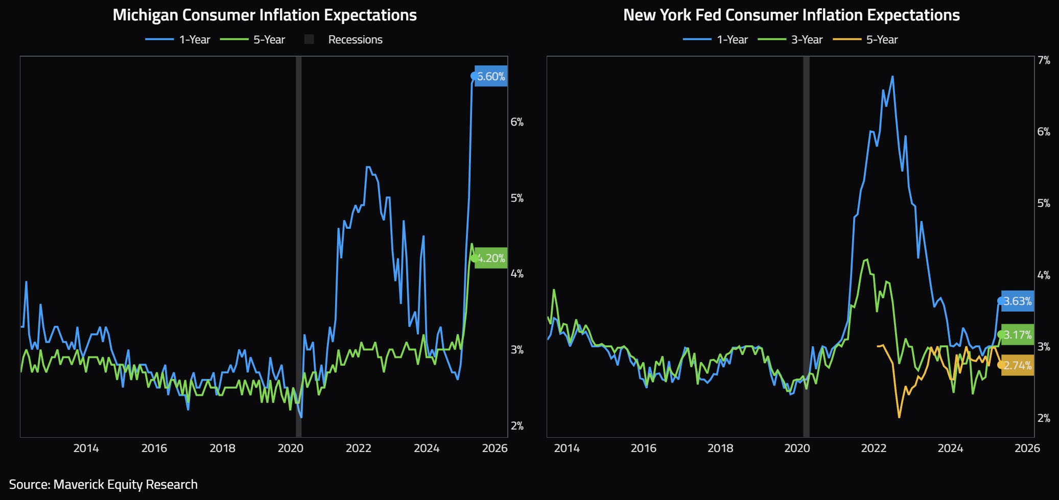
Maverick’s net take - 3 key points and future dedicated research:
which survey better? Are the consumer a good gauge for future inflation, or are they exaggerating/over-shooting future realised inflation?
there are many inflation ins and outs: factors, variables, indices, metrics, surveys for expectations, indicators and pricing instruments
there are also leading inflation indicators which gets even more interesting
To cover all these 3 key points, a dedicated and comprehensive research will be done via 2 Maverick Special Macro reports:
✍️ Inflation Ins & Outs = Interest Rates, Money Supply, Fiscal Stimulus, Wages, Oil, Supply Chains & More
✍️ Inflation: Pricing, Expectations & Leading Indicators
📊 Bonus charts: TACO vs MATT = Maverick Ate The TACO (MATT) way earlier on the 5th of April, just 3 days after Liberation/Tariff day from April 2nd 📊
Latest on Wall-Street is the ‘TACO trade’ (TACO = Trump Always Chickens Out):
an investment strategy in response to Trump's tariff on and off policies
buying as the market dips when Trump announces steep tariffs on the assumption that he will back off/negotiate his tariff stance, hence the market to rebound

2025 basically in TACO Territory: threats made and then rescinded (SPY/TLT):
Therefore, in 2025 Fear & Greed was seen clearly, often and switching fast:
👉 ‘we are back’ in Greed territory at 63 as ‘trade talks’ evolved overall positively
👉 going forward and in general, for a Maverick contrarian approach considering the 25 (green) and 75 (red) dotted discretionary levels for Buying Fear and Selling Greed

Now it took most quite a while to see that negotiations will be the way, except you reading this publication doing independent investment economic research - besides being prepared, you started to eat and enjoy the TACO since then to today 😉.
That is the fact that U.S. backed up and started to negotiate quite fast … as I foresaw and tweeted about on April 5th (just 3 days after Liberation Tariff day):
👉 ‘I mean at some point Trump will have to negotiate’
👉 ‘In any case, for me a good period to collect / harvest geopolitical risk premium’
A Maverick chart for 10,000 words with the the S&P 500 and relevant annotations:
👉 'TACO' vs 'MATT' (Trump Always Chickens Out vs Maverick Ate The TACO)
Do you want higher returns? Yes! Was this an opportunity? Yes! Was this an outlier for higher returns? No! Will we have others in the future? Yes! Is there a price to pay? Yes! ‘Mav, what is the price to pay for higher returns?’ Volatility and Drawdowns!
Want proofs? Yes! Another Maverick-esque very rare chart you don’t see elsewhere!
How did the S&P 500 do after various historical scares? Annualised returns:
👉 14.9%/year since the August 2011 U.S. sovereign debt downgrade from AAA
👉 15.8%/year since the February 2016 ‘Factormageddon’ episode
👉 17.7%/year from December 2018 ‘far from neutral’ on interest rates normalisation
👉 21.5%/year from the March 2020 Covid pandemic
👉 28.1%/year from the September 2022 ultra fast FED interest rates hikes
N.B. and I did not even include the 2007-2009 Global Financial Crisis - even higher returns from that major moment in the history of economic and financial markets!
On the current TACO / Trade War environment, complementary via Bloomberg’s "Wall Street Games Out How to Profit From Trump Tariff Flip-Flops": “According to Nomura, betting against S&P 500 futures every time Trump escalates his rhetoric and then buying them five days later would have yielded 12% since the beginning of February.”

✍️ Incoming Maverick-esque research! ✍️
What is coming next through the independent investment & economic research here? Many drafts are work in progress - below a few selected ones:
✍️ Full Equity Research
section start where I will cover in details single businesses/stocks aka deep dives
✍️ Why Independent Investment and Economic Research = Paramount Nowadays!
common sense is not so common, independent research for the win!
✍️ The State of the US Economy in 75 Charts, Edition #4
coming up with further improved coverage charts + recession probability metrics
✍️ Maverick Special Situation #7
how to hedge, lock in the gain or speculate on a very popular stock nowadays
✍️ S&P 500 Report #6: Valuation, Fundamentals & Special Metrics
coming up with further improved metrics via sleek Maverick charts as always
✍️ Maverick Special Report #7: Big Volatility & Drawdowns = Juicy Returns
the price for high returns = digesting and taking advantage of volatility
✍️ Maverick Special Report #8: U.S. Manufacturing = A Bad Wet & Fake Dream
manufacturing is romantic, but not realistic for good reasons for the U.S.
✍️ Maverick Special Report #7: Harvesting Geopolitical Risk Premium Through The 2025 Trade War
taking advantage of the ‘Trade War 2.0’ which drives volatility these days
✍️ Top 50 Maverick Charts to Watch in 2025 and Beyond
sleek Maverick charts with many insights & food for thought for now & the future
Research is NOT behind a paywall and NO pesky ads here unlike most other places!
Did you enjoy this by finding it interesting, saving you time and getting valuable insights? What would be appreciated?
Just sharing this around with like-minded people, and hitting the 🔄 & ❤️ buttons! That’ll definitely support bringing in more & more independent investment research: from a single individual … not a corporate, bank, fund, click-baity media or so … !
Like this, the big positive externalities become the name of the game! Thank you!
Have a great day! And never forget, keep compounding: family, friends, hobbies, community, work, independence, capital, knowledge, research and mindset!
With respect,
Mav 👋 🤝