✍️ Maverick Valuations #2 - USA: Dow Jones, Nasdaq 100 & the mighty S&P 500
Sleek Visuals & Analytics because they say 1,000 words & further food for thought!
Dear all,
as Q1 2023 earnings season is over and Q2 season kicked off this week, it’s the perfect time for the 2nd edition of the ‘Maverick Valuations’ report covering USA, precisely the big 3: Dow Jones, Nasdaq 100 and the S&P 500 indices (Edition 1 here). Namely, 30 + 100 + 500 = 630 stocks. How? Via Sleek Visuals & Analytics because they say 1,000 words. This edition comes with improvements as I managed to secure more data and create special new visuals. Research is NOT behind a paywall & no pesky ads around.
This report is unique, hence quite ‘Maverick-esque’ as I tried to find it done & served somewhere else (comfy, no?), be it by banks, overall media, or independent investment researchers like myself. I was naturally willing to pay for a good and regular service straight to my inbox, yet none, but if you find similar somewhere, please let me know. Therefore, I decided to create it and plan to further improve it as we move forward.
1-click to subscribe if you aren’t yet receiving my research & sharing this around.
Report structure = the big 3 stock indices + bonus:
📊 Dow Jones … aka ‘The Dow’ 📊
📊 Nasdaq 100 … aka ‘Tech’ 📊
📊 S&P 500 … aka ‘The Market’ 📊
= 30 + 100 + 500 = 630 stocks via sleek visuals
🏦 Bonus Charts 🏦
What are the various likely use cases provided by this report & visual analytics? Research for market leaders & laggards, likely un/warranted cheap or expensive stocks, peers analysis, stock screener, outliers, positive or negative momentum, relative strength, full equity research on single stocks & general market assessment.
My favorite use cases:
finding future winners via further deep dives / full equity research
finding stocks that did well across past tough times, hence resilient winners … which are likely also going forward to be future winners
finding ‘Pick & Shovel’ businesses that span across industries with many use cases which can make tick 2 boxes in the same time: limited downside risk though still keeping good potential upside
Great to have at hand at least 8 times per year: before & after each of the 4 quarterly earnings. An overall yearly recap is also very interesting. Let’s see now after Q1 2023 earnings & usefully compare going forward with the future editions. Check your stocks & the outliers in the scatterplots, it can get interesting & food for thought.
To start, the 2023 and 10 years Total Returns & CAGR of the big 3 indices: sentiment is very positive, risk appetite is on and we have a new bull market.
📊 Dow Jones … aka ‘The Dow’ 📊
Let’s start with the Dow Jones Industrial Average (DJIA). Created in 1896, is one of the oldest & most widely recognized stock market indices in the world & and is made up of 30 blue-chip stocks that are considered leaders in their respective industries.
9 visuals total - 1 for sector breakdown, 2 price/performance views, 6 on valuations:
Sectors Breakdown to begin with:
Performance:
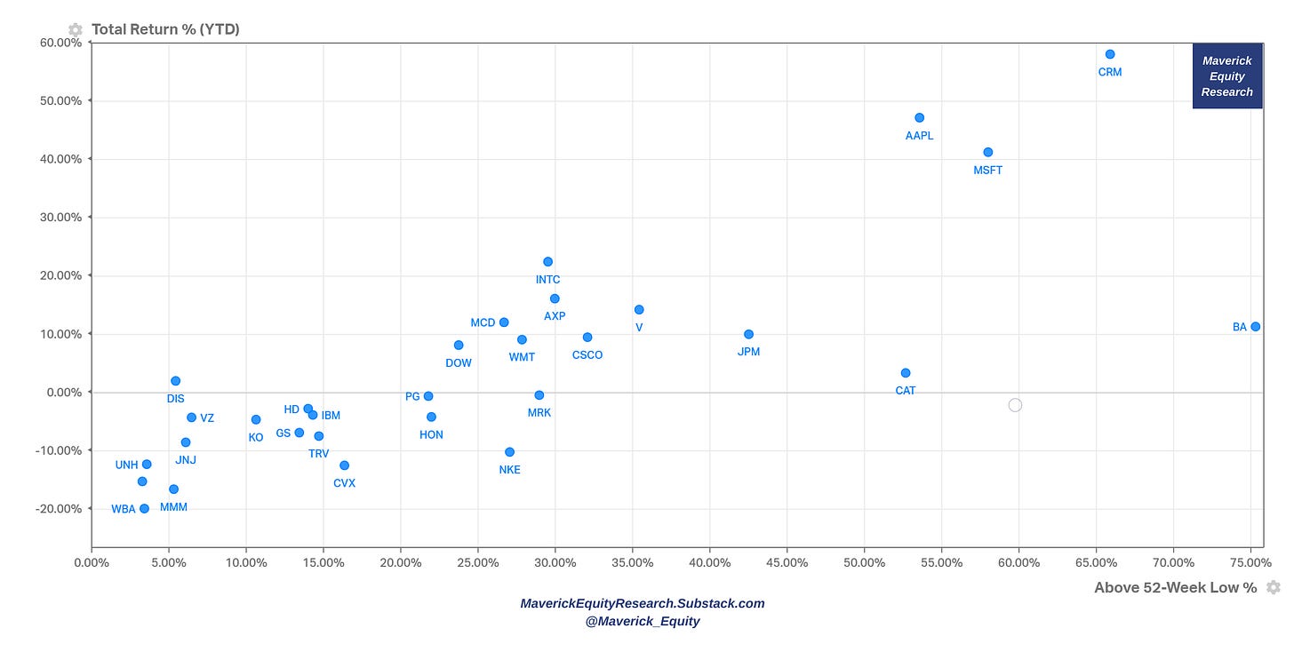
Price action: 2023 YTD Winners & Rebounders from their 52-week low
Price action: stocks Above their 52-week Lows & Below their 52-week Highs
Valuation:
P/S multiple with Revenue growth (next year estimates) for a ‘Top-line’ view. Interpretation: Forward P/S multiple the stock is trading at for the given level of estimated Sales growth
The percentile of each stock’s forward P/S ratio vs their 10-year history coupled with 2023 total returns (a Maverick-esque visual which you do not see around)
P/E multiple with Earnings/EPS growth (next year estimates), a ‘Bottom-line’ view:
Interpretation: Forward P/E multiple the stock is trading at for the given level of estimated Earnings/EPS growth
The percentile of each stock’s forward P/E ratio vs their 10-year history coupled with 2023 total returns (a Maverick-esque visual which you do not see around)
P/FCF multiple with FCF/Share (last twelve months) for a ‘Cash Flow’ view.
Interpretation: P/FCF multiple the stock is trading at for the given level of FCF/Share
The percentile of each stock’s P/FCF ratio vs their 10-year history coupled with 2023 total returns (a Maverick-esque visual which you do not see around)
📊 Nasdaq 100 … aka ‘Tech’ 📊
And the Nasdaq 100 because Tech is Tech. Created in 1985, it tracks the performance of the 100 largest non-financial companies listed on the Nasdaq exchange by being heavily weighted towards technology & growth-oriented companies.
9 visuals total - 1 for sector breakdown, 2 price/performance views, 6 on valuations:
Sectors Breakdown to begin with:
Performance:
Price action: 2023 YTD Winners & Rebounders from their 52-week low
Price action: stocks Above their 52-week Lows & Below their 52-week Highs
Valuation:
P/S multiple with Revenue growth (next year estimates) for a ‘Top-line’ view. Interpretation: Forward P/S multiple the stock is trading at for the given level of estimated Sales growth
The percentile of each stock’s forward P/S ratio vs their 10-year history coupled with 2023 total returns (a Maverick-esque visual which you do not see around)
P/E multiple with Earnings/EPS growth (next year estimates), a ‘Bottom-line’ view:
Interpretation: Forward P/E multiple the stock is trading at for the given level of estimated Earnings/EPS growth
The percentile of each stock’s forward P/E ratio vs their 10-year history coupled with 2023 total returns (a Maverick-esque visual which you do not see around)
P/FCF multiple with FCF/Share (last twelve months) for a ‘Cash Flow’ view.
Interpretation: P/FCF multiple the stock is trading at for the given level of FCF/Share
The percentile of each stock’s P/FCF ratio vs their 10-year history coupled with 2023 total returns (a Maverick-esque visual which you do not see around)
📊 S&P 500 … aka ‘The Market’ 📊
And the mighty S&P 500 aka ‘The Market’. It was first introduced in 1957 and it has become one of the most widely followed & cited indices in the world which tracks the performance of the 500 largest publicly traded companies in the US.
38 visuals total - 2 price/performance views, 6 for index level valuation, 6 for single stocks valuations that shape the S&P 500 index, and 24 for the 11 sectors breakdown.
Performance:
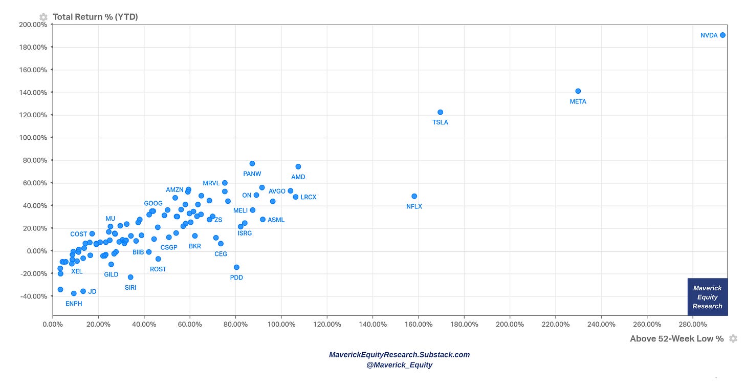
Price action: 2023 YTD Winners & Rebounders from their 52-week low
Price action: stocks Above their 52-week Lows & Below their 52-week Highs
Tech, AI, semiconductors and consumer discretionary are leading and hot, while energy, cruises & travel cooled off in the last year
Valuation at the index level:
S&P 500 forward EPS & price - price decoupled strongly between 2020-2021, 2022 brought a bear market which made price & EPS be aligned again while these days price & EPS are again slightly disconnected … to be followed if this continues as it might a good sign that the S&P 500 is overvalued on the short term
S&P 500 forward P/E ratio with 5 & 10-year averages: forward 12-month P/E at 18.9x which is above the 5-year average of 18.6x & above the 10-year 17.4x average
S&P 500 current 10-year PE (CAPE) ratio: at 30.3x it is 50% above the long term historic trend CAPE of 20.2x, or approximately 1.3 standard deviations above trend, hence considered Overvalued.
More info for chart understanding and interpretation: CAPE ratio data series with the y-axis as baseline 0 at the average CAPE ratio value of 20.2x with horizontal bands representing standard deviations from that average
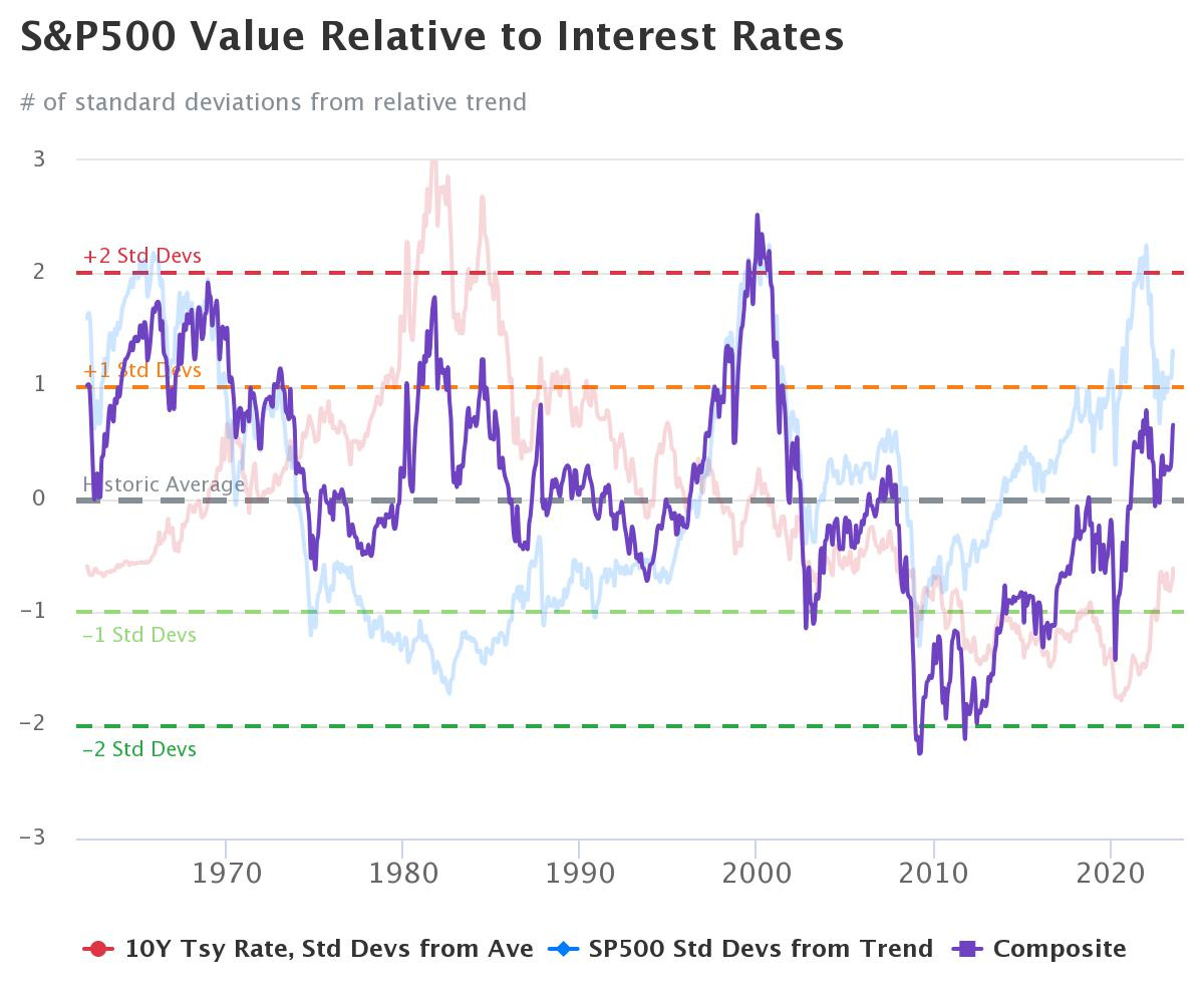
S&P 500 valuation relative to Interest Rates: relative to a normal interest rates environment, the US stock market is Fairly Valued. Further info for rationale:
Interest Rates overview via the U.S. government bond yields 1y 2y 3y 5y 10y 30y with a 20-year lookback period:
3 hiking cycles in 20 years: not the 1st one nor the last one
currently way above the 2015-2019 period and around the 2004-2009 cycle
Background on the valuation model: it is a sum of US Treasury interest rates relative to historical average (red) & the S&P500 price relative to its own exponential trend line (blue). The two relative performance indicators for interest rates (red) & stocks (blue) have been combined, showing a composite value in purple.
Interpretation: as of July 7, 2023, the 10Y Treasury bond rate was 4.06%, which is 0.61 standard deviations below normal. Likewise, the S&P500 index value of $4,399 is 0.9 standard deviations above its own respective trendline. Summing the two together, this gives a composite value of 0.66 standard deviations above normal, indicating that stocks are currently Fairly Valued.
Mean-Reversion valuation: S&P 500 is currently 1.3 standard deviations above its historical trend line, suggesting the market is currently Overvalued.
Last but not least, the Buffett Indicator at 1.5 standard deviations above the trend value (129%) is indicating Overvaluation.
Background on the valuation model: the Buffett Indicator expresses the value of the US stock market in terms of the size of the US economy. That is the Aggregate US Market Value = $46.79 trillion divided by the Annualized GDP = $26.71 trillion, hence resulting to 175% which is 45.82% (or 1.5 standard deviations) above the historical trend line, suggesting that the stock market is Overvalued relative to GDP.
Valuation for the Single Stocks that shape the S&P 500 index:
Now that we looked at the index level, let’s get more granular & dive deeper by looking inside the index 500 constituents.
P/S multiple with Revenue growth (next year estimates) for a ‘Top-line’ view. Interpretation: Forward P/S multiple the stock is trading at for the given level of estimated Sales growth
The percentile of each stock’s forward P/S ratio vs their 10-year history coupled with 2023 total returns (a Maverick-esque visual which you do not see around)
P/E multiple with Earnings/EPS growth (next year estimates), a ‘Bottom-line’ view.
Interpretation: Forward P/E multiple the stock is trading at for the given level of estimated Earnings/EPS growth
The percentile of each stock’s forward P/E ratio vs their 10-year history coupled with 2023 total returns (a Maverick-esque visual which you do not see around)
P/FCF multiple with FCF/Share (last twelve months) for a ‘Cash Flow’ view.
Interpretation: P/FCF multiple the stock is trading at for the given level of FCF/Share
The percentile of each stock’s P/FCF ratio vs their 10-year history coupled with 2023 total returns (a Maverick-esque visual which you do not see around)
Deep dive into the 11 sectors that shape the S&P 500:
Naturally, given that 500 companies can get quite cluttered into one single chart, the 11 sectors making the S&P 500 index deserve each their own further deeper analytics.
Legend for the newer investors & recall for the experienced: XLC = Communication Services, XLY = Consumer Discretionary, XLK = Technology, XLB = Basic Materials, XLI = Industrials, XLF = Financials, XLRE = Real Estate, XLE = Energy, XLP = Consumer Staples, XLV = Health Care, XLU = Utilities
Sectors Breakdown:
Performance:
Price action: 2023 YTD sectors Leaders & Laggards - Technology KLX +42%, Communications XLC +40.5% and Consumer discretionary XLY with +36.1% leading, while Health Care XLV -2.2%, Utilities -3.7% and Energy -5% as laggards
Price action: 2023 YTD sectors Winners & Rebounders from their 52-week low
We have the same key message: XLK, KLC & XLY also with the momentum from their 52-week lows while note that now XLV, XLU & XLE are also considerably positive
Price action: sectors Above their 52-week Lows & Below their 52-week Highs
Note how close XLK, XLC, XLY and XLI are to their 52-week highs (green) while XLE, XLU and XLRE are more distant but not much
Valuation:
S&P 500 forward P/E ratios for the 11 Sectors & the S&P 500 itself: Technology, Consumer Discretionary & Consumer Staples with the highest multiple while on the lower end, Energy, Financials & Health Care
Complementary, the 11 sectors forward earnings valuations relative to the S&P 500:
"Each sector and subgroup tends to trade at a specific premium or discount to the market over time. Currently, all sectors trade at a discount to this relationship except Technology" via CS.
Moving on for further granularity via valuation scatterplots: 2 valuation scatterplots (P/S & P/E) for each of the 11 sectors = 22 visuals
XLK - Technology
P/S multiple with Revenue growth (next year estimates) for a ‘Top-line’ view
P/E multiple with Earnings/EPS growth (next year estimates), a ‘Bottom-line’ view
Given the recent mega tech run, a special chart for this sector: hard to say it its cheap via the forward P/E relative to that of the S&P 500 and PEG ratio (measures investors’ willingness to pay for a company’s earnings growth):
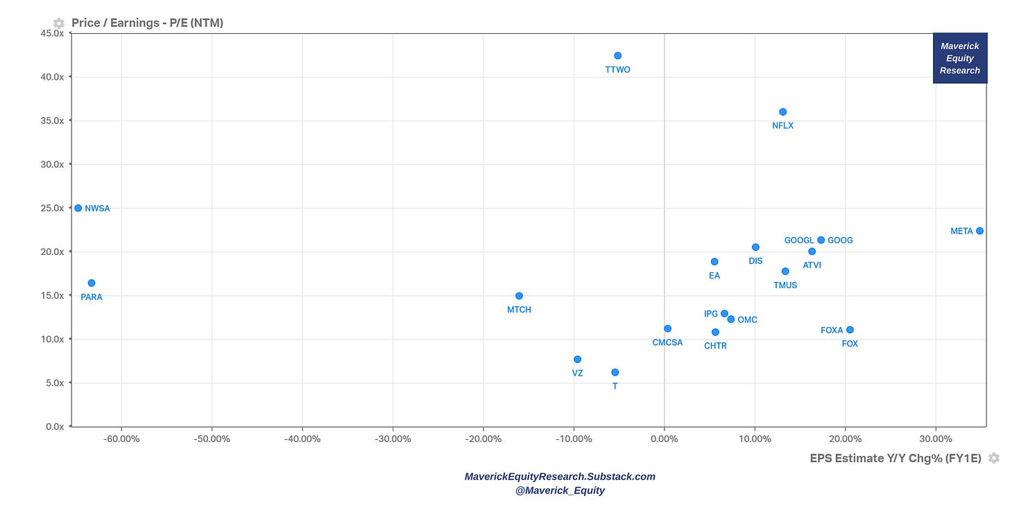
XLC - Communications
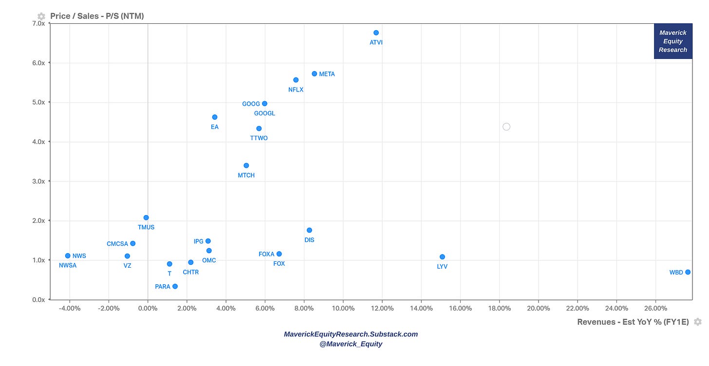
P/S multiple with Revenue growth (next year estimates) for a ‘Top-line’ view
P/E multiple with Earnings/EPS growth (next year estimates), a ‘Bottom-line’ view
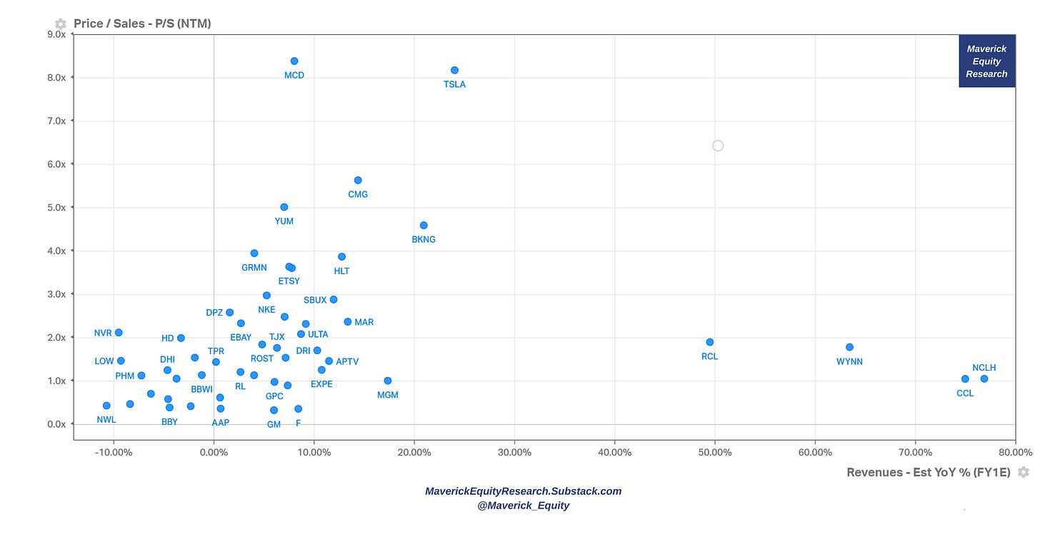
XLY - Consumer Discretionary
P/S multiple with Revenue growth (next year estimates) for a ‘Top-line’ view
P/E multiple with Earnings/EPS growth (next year estimates), a ‘Bottom-line’ view
XLE - Energy
P/S multiple with Revenue growth (next year estimates) for a ‘Top-line’ view
P/E multiple with Earnings/EPS growth (next year estimates), a ‘Bottom-line’ view
XLRE - Real Estate
P/S multiple with Revenue growth (next year estimates) for a ‘Top-line’ view
P/E multiple with Earnings/EPS growth (next year estimates), a ‘Bottom-line’ view
XLF - Financials
P/S multiple with Revenue growth (next year estimates) for a ‘Top-line’ view
P/E multiple with Earnings/EPS growth (next year estimates), a ‘Bottom-line’ view
XLV - Health Care
P/S multiple with Revenue growth (next year estimates) for a ‘Top-line’ view
P/E multiple with Earnings/EPS growth (next year estimates), a ‘Bottom-line’ view
XLP - Consumer Staples
P/S multiple with Revenue growth (next year estimates) for a ‘Top-line’ view
P/E multiple with Earnings/EPS growth (next year estimates), a ‘Bottom-line’ view
XLU - Utilities
P/S multiple with Revenue growth (next year estimates) for a ‘Top-line’ view
P/E multiple with Earnings/EPS growth (next year estimates), a ‘Bottom-line’ view
XLI - Industrials
P/S multiple with Revenue growth (next year estimates) for a ‘Top-line’ view
P/E multiple with Earnings/EPS growth (next year estimates), a ‘Bottom-line’ view
XLB - Materials
P/S multiple with Revenue growth (next year estimates) for a ‘Top-line’ view
P/E multiple with Earnings/EPS growth (next year estimates), a ‘Bottom-line’ view
🏦 Bonus Charts 🏦
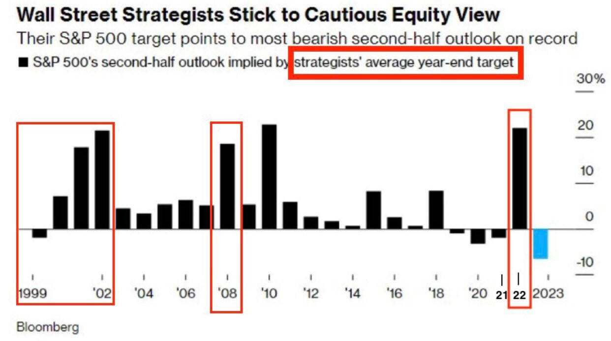
How does Wall Street see the S&P 500 for the rest of 2023? The most bearish second-half outlook on record which historically has been a contrarian indicator.
How do the S&P 500 companies themselves see the outlook going forward? Highest Number Companies with positive EPS Guidance since Q3 2021!
Complementary by the 11 sectors shaping the S&P500:
Top 10 stocks in the S&P 500 by market cap weight VS their earnings contribution: they go in different directions lately with earnings contribution lagging materially
Have you ever wondered what is the stocks overlap between the big 3 indices?
Have you ever wondered the contribution of profits each sector from the 11 has to the S&P 500 index overall & the evolution in time? There you go with a freshly updated chart from 1976 to Sep 2022 via GS:
Have you ever wondered who owns the US stock market by investor type? 2 main takeaways:
👉 market is structurally net long = tailwind, put that into memory as an investor …
👉 what hedge funds do and general headlines, eye-balls & click baits are not relevant in the bigger picture ...
Have you ever wondered: what is the historical performance of the S&P 500 one year after the last FED rate hike? Index itself, sector & style breakdown:
Did you enjoy this extensive research by finding it interesting, saving you time & getting valuable insights? Now some of you asked how can one support me which is really kind of you 🤗. Therefore, it would be great & highly appreciated if you would support an independent investment researcher for the ‘Maverick-esque’ ongoing & future research. A donation or a tip to support my work can be done via the following:
Thank you & have a great day!
Mav












Great analysis, always improving!
I see this 2nd edition indeed came with quite some improvements … thanks man! appreciate, loved especially the valuation on the index level and also the drill down into the sectors … helps me a lot to connect the dots with so many angles … thx!