✍️ Zooming Out via 100+ Years Charts = Leveraging Deep History to Navigate the Future
Global Investment Returns Yearbook 2024 + Maverick Charts that say 10,000 words!
Dear all,
a special today via the just published great Global Investment Returns Yearbook 2024, which across time has clearly become an authoritative guide to the historical long-run returns that any investor should now just know about, but fully immerse into it.
Now in its 25th year, the body work by Professor Paul Marsh, Dr. Mike Staunton of London Business School, and Professor Elroy Dimson of Cambridge University is a great source for the analysis of the long-term performance of global financial assets.
Specifically, it covers all the main asset categories in 35 markets. Most markets, as well as the world index have 123 years of data since 1900.
Awesome work and definitely one of my favorite reads every year!
You can read the 57 pages, and/or below you can save time via my 15 key highlights and charts, and also gain insights via my complementary personal notes. After the yearbook coverage, my 7 bonus charts and key insights that are very complementary!
Report structure and table of contents as a logical and smooth preview:
📊 Global Investment Returns Yearbook 2024 - 15 key highlights and insights
Switzerland investing = when ‘swissness’ is real and works
USA investing = the biggest and the best, though be aware of ‘success’ bias
How much do US stocks return to investors + how are returns distributed?
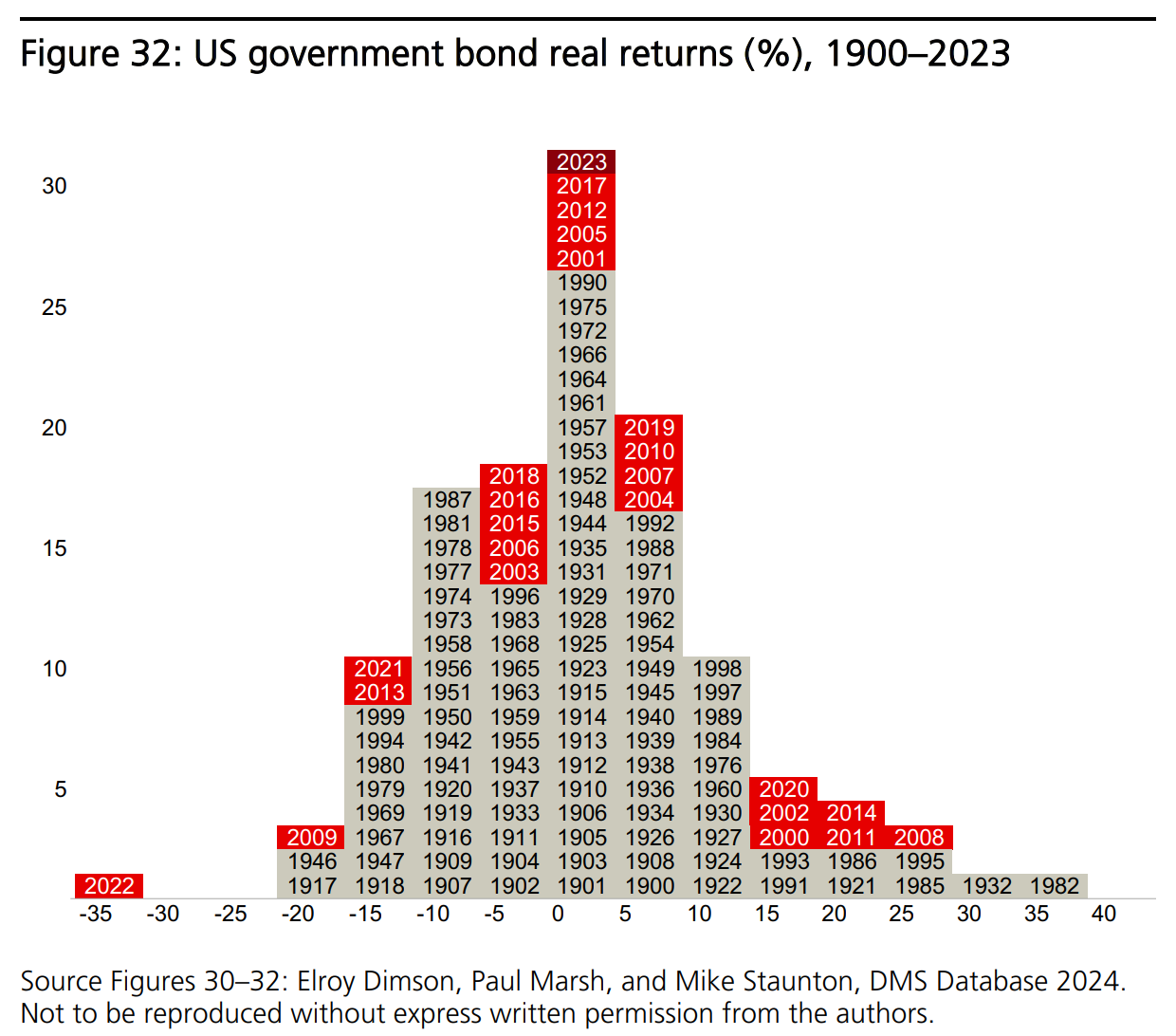
What about US government bonds returns to investors + the distribution?
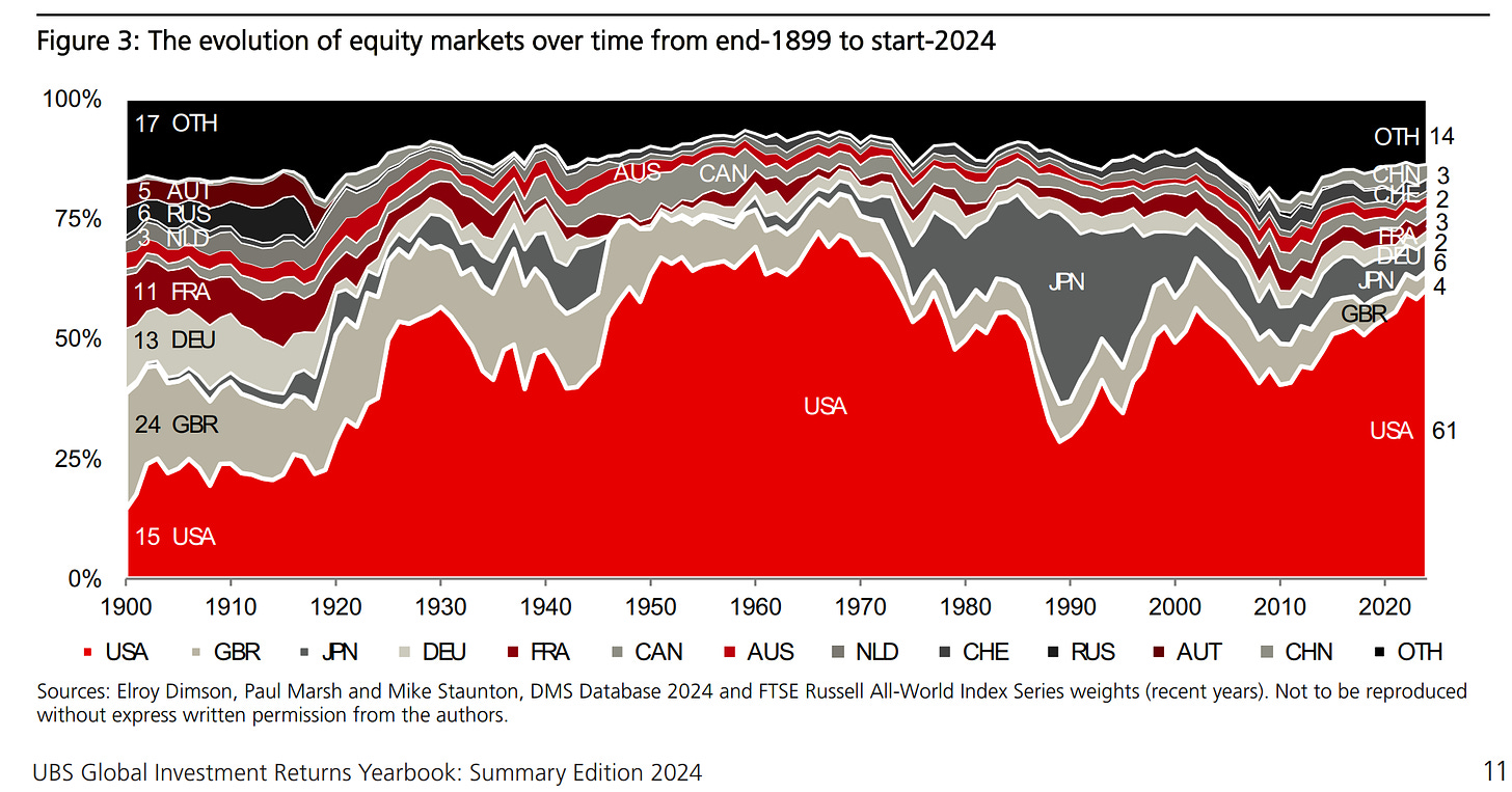
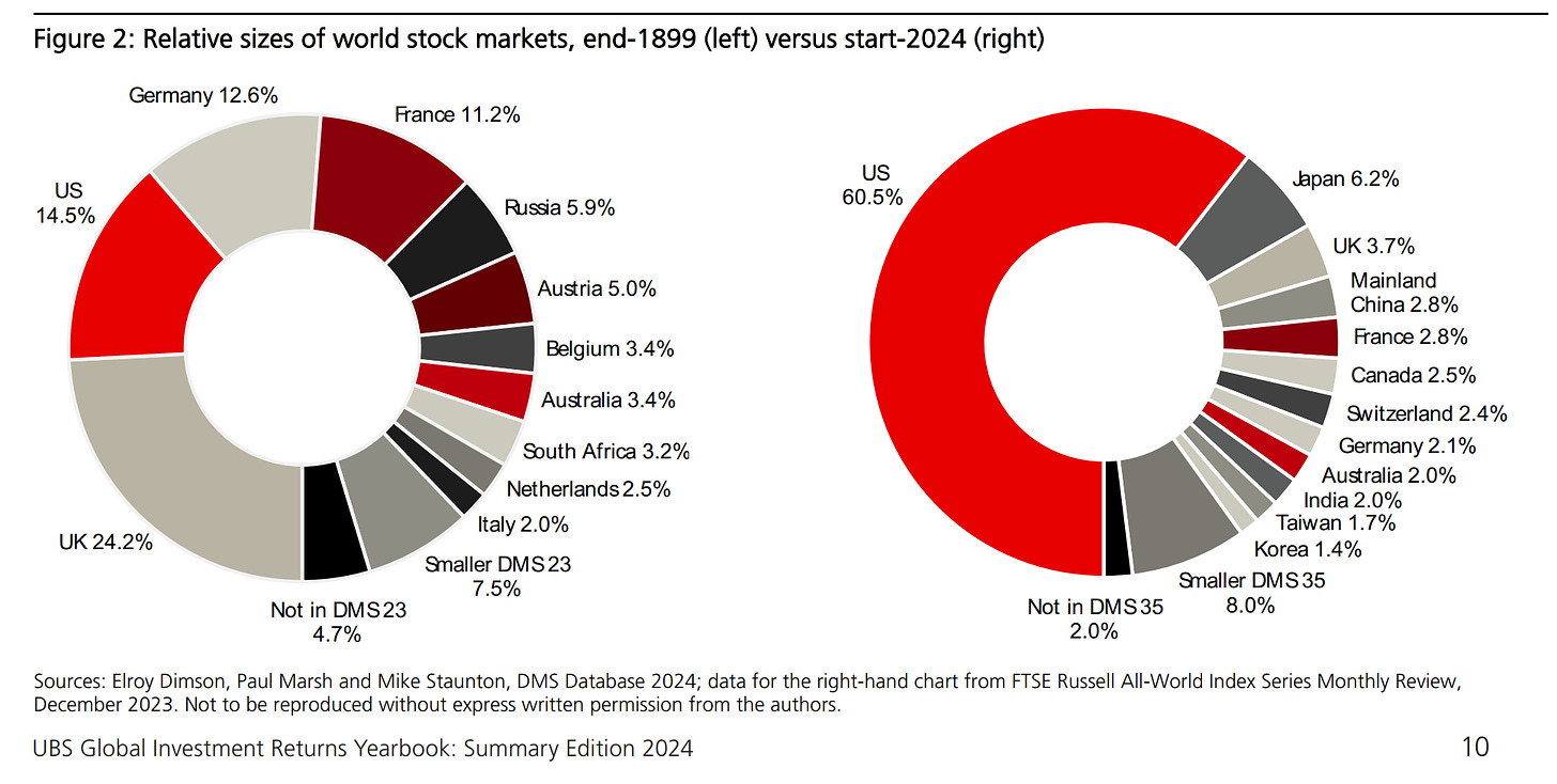
The Evolution of Global Equity Markets from 1899 to 2024
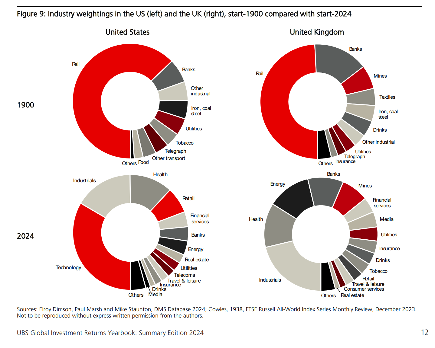
New Economy vs Old Economy = Innovation & Disruption vs Classic players
What Do the Bad & the Good times (business cycle) tell global investors?
The Fear of the Downside and how does Downside look like exactly?
After the Bad and Ugly Downside Drawdowns, how do Recoveries look like?
US debt market by type of security
Default rates on US Corporate bonds
Going global: default rates on global Corporate bonds by bond rating
Key points & Bonds 101 - defaults rates, recovery rates and ultimately the most important credit loss rates
Countries time: Moody’s credit ratings for sovereign bonds around the world
Lastly on bonds, the Credit Premium: how large is the credit risk premium?
👍 Bonus: 7 long-term Maverick Charts … that say 10,000 words! 👍
110 years of Inflation in one Maverick chart
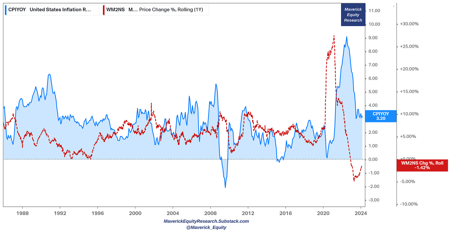
35 years of Inflation rate and M2 money supply growth
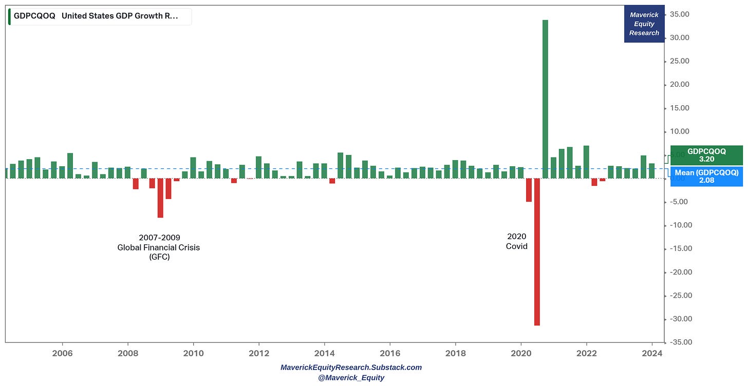
Real GDP quarterly growth rate for the last 20 years
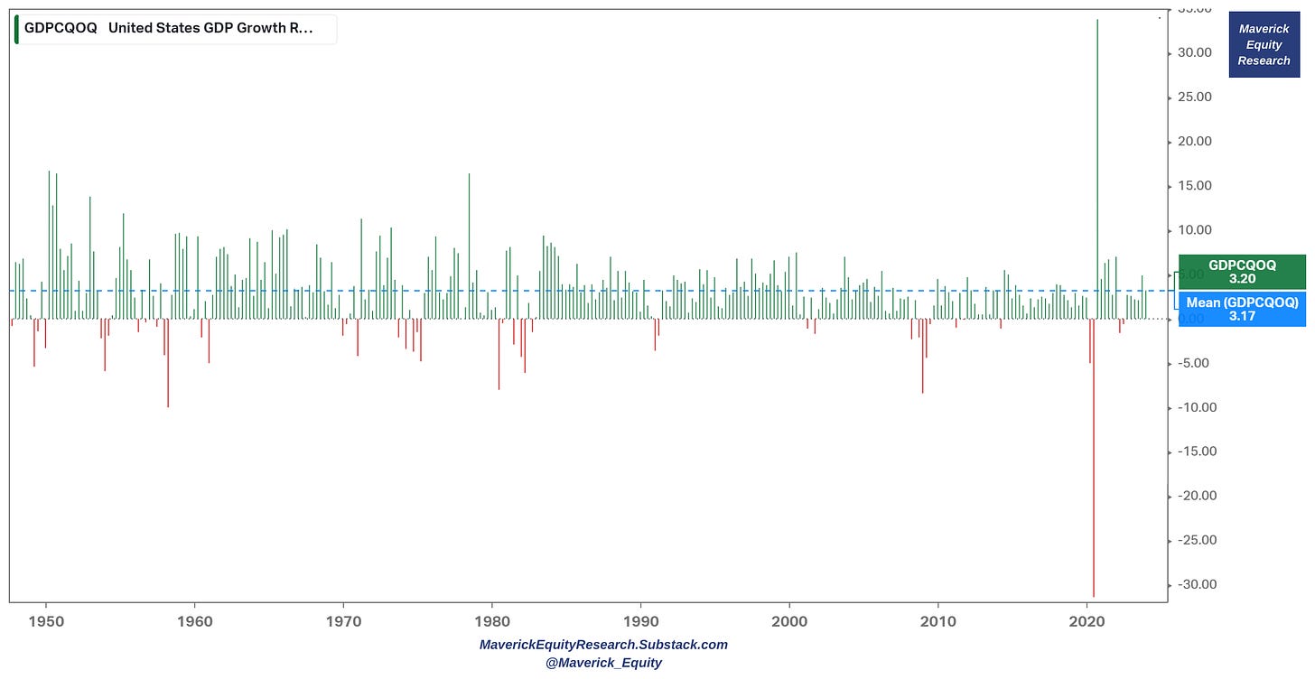
Zooming out with the same GDP real quarterly growth via a 75-year time frame
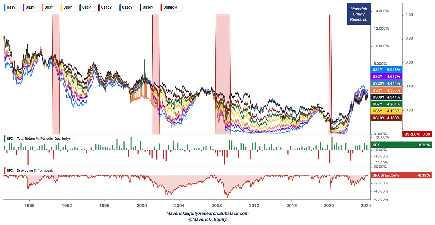
The mighty S&P 500: 35 years of US interest rates, quarterly returns & drawdowns
'US Tech is Taking Over the World Baby!'
'US Semiconductors are Taking Over the World Baby!'
📊 Global Investment Returns Yearbook 2024
Before juicy charts, why are IMHO long-term time series very important and useful?
long term historical data is the past, while investing is an uncertain forward looking endeavour, yet a rich history is a good gauge of future outcomes
it shows how do asset classes behave in terms of risk & return across many business cycles, where in general each is caused by different factors and events
from there we need to be aware that the structure of the economy in 1900 is not the same with the one from the 1930s, 1980s, 2000, let alone 2024 … yet human psychology in both bad times and good euphoric ones is not that different
e.g. example of different economies in time is the banking system. I see too often many doom & gloom, fear mongering charts on Banking these days and analogies to 2007-2009: well, the today’s banking system is way more solid than back then. Additionally, the resolution mechanisms and tools that regulator have are way more and bigger. Just check how the First Republic Bank (FRC) and Silicon Valley Bank (SVB) were handled in US, and Credit Suisse (CS) in Europe … then check how much banking stocks gained since then, and also stocks in general …
from there, making parallels and further useful inferences for the future is a judgement call based on experience, skill and other good complementary data
long-term data across business cycles is something all types of investors & traders should be looking into heavily, be it for the short or long term, focused on stocks, bonds, macro, real estate, crypto or commodities … you name it!
last but certainly not least, in the daily flow of news, hot takes and all the noise around (most useless imho), losing sight of the key big picture is easy, hence my post serves as how important it is to zoom out & have a ‘Maverick’ birds eye view ;)
👉 Switzerland investing = when ‘swissness’ is real and works
Switzerland is a place that I rarely see across the radar of US investors especially, and still to today I cannot understand why. Maybe because the marketing and narrative is more like the Swiss culture: discreet, neutral, no hype, no YOLO, FOMO, EOMO, don’t attract much attention, privacy as a strong value & asset, and just let things work!
I really believe most investors’ portfolios should resemble the description above, and not focusing on alpha, beta, YOLO, FOMO, 10-100 baggers, showboating with results in good times, hiding the results in bad ones, hot trades, short term thinking, treating investing as a pis*ing contest relative to friends, neighbors and strangers online.
Only institutional investors have the burden and big limitation of having mandates and benchmarks, hence from there face career risk. As a retail investor, one is fully free which not many realise how big of an advantage it is!
Special situations, cheap hedging opportunities and occasional opportunistic trades have their sweet place, but overall good medium-long term investing is rather boring & smart, not the high thrill of randomly moving tickers on a screen … .
Back to Switzerland now:
The Swiss stock market traces its origins to exchanges in Geneva (1850), Zurich (1873), and Basel (1876) and it is now the world’s 7-largest equity market, accounting for 2.4% of the total world value.
Performance wise since 1900 = many bad time & business cycles, hence time tested, let’s see now what the data says in terms of real returns (after inflation is counted):
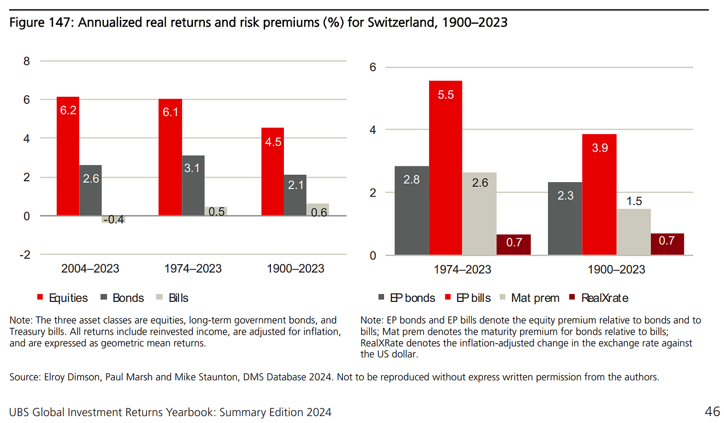
Swiss equities: 4.5% real return (equal to the median across countries) while in recent history: 6.1% for the period 1974-2023 and 6.2% for the period 2004-2023
Swiss Bonds: Switzerland has been the world’s best performing government bond market, with an annualized real USD return of 2.8% (it ranks 2nd in real local currency return, with an annualized return since 1900 of 2.1%), while in recent history: 3.1% for the period 1974-2023 and 2.6% for the period 2004-2023
Swiss non-inflation: the world’s lowest 124-year inflation rate of just 2.1%
Swiss Franc = the world’s strongest currency
I will also cover soon stocks from Switzerland via the Full Equity Research section! Swiss bonds will also be covered via ‘Model Portfolios’ that I will offer in the future!
What is the general rationale to invest in Switzerland (not just home biased countries)?
Investing channel:
Cash flow diversification
Currency diversification which can also act in the same time as natural hedges via the Swiss franc (CHF) for outside international investors
Save haven / flight to safety in times of geopolitical tensions and business cycle turns for an overall more balanced, less volatile & with lower drawdowns portfolio
Economic, political and until lately, under considered but key Geopolitical reasons, specifically quite a ‘Maverick-esque’ opinion that often raises eyebrows when I say it: “In the of the day, there is only one true AAA rating country out there: SwitzerlAAAnd!”
Neutrality, no wars, trusted by the rest of the world which was a key factor for a lot of generations after generations to accumulate and compound wealth
Direct democracy & federalism works given the decentralized driven efficiencies
Balanced fiscal budget
Conservatively managing current account C/A surplus
Low debt & low rates of inflation
Swiss National Bank (SNB) reserves: 100% forex reserves relative to GNP, big 'mutual fund' inside tracking MSCI USA index with a 80/20 allocation between bonds & stocks (algorithmically rebalanced)
Low taxes with loads of 🧀+⛰️+🍫
Wrapping up this section, a great time to bring a key yearbook takeaway from UBS:
“It’s only by looking at the rise and fall of various asset classes over time that you can truly understand the importance of diversification and the full value of a disciplined asset allocation approach.”
👉 USA investing = the biggest and the best, though be aware of ‘success’ bias
US = the world’s biggest economy and political power
US = has the mighty green dollar $ as the world’s reserve currency
US = the world’s number one oil producer
US stock market accounts for 60.5% of total world value, which is almost 10 times as large as Japan, its closest rival; the US also has the world’s largest bond market
This reflects the superior performance of the US economy, the large volume of IPOs, and the substantial returns from US stocks. No other market can rival this long-term accomplishment
Though be aware that extrapolating from such a successful market can lead to “success” bias - investors can gain a skewed view about future equity returns both elsewhere and for the US itself
Going global with investing might not be a bad idea imho. Investors can diversify and potentially have a more resilient portfolio without sacrificing a lot of the returns. In investing it is very hard to increase expected returns, yet not hard to keep expected returns similar, yet reduce downside risk via lower drawdowns and volatility.
Performance wise since 1900 = many bad time & business cycles, hence time tested, let’s see now what the data says in terms of real returns (after inflation is counted):
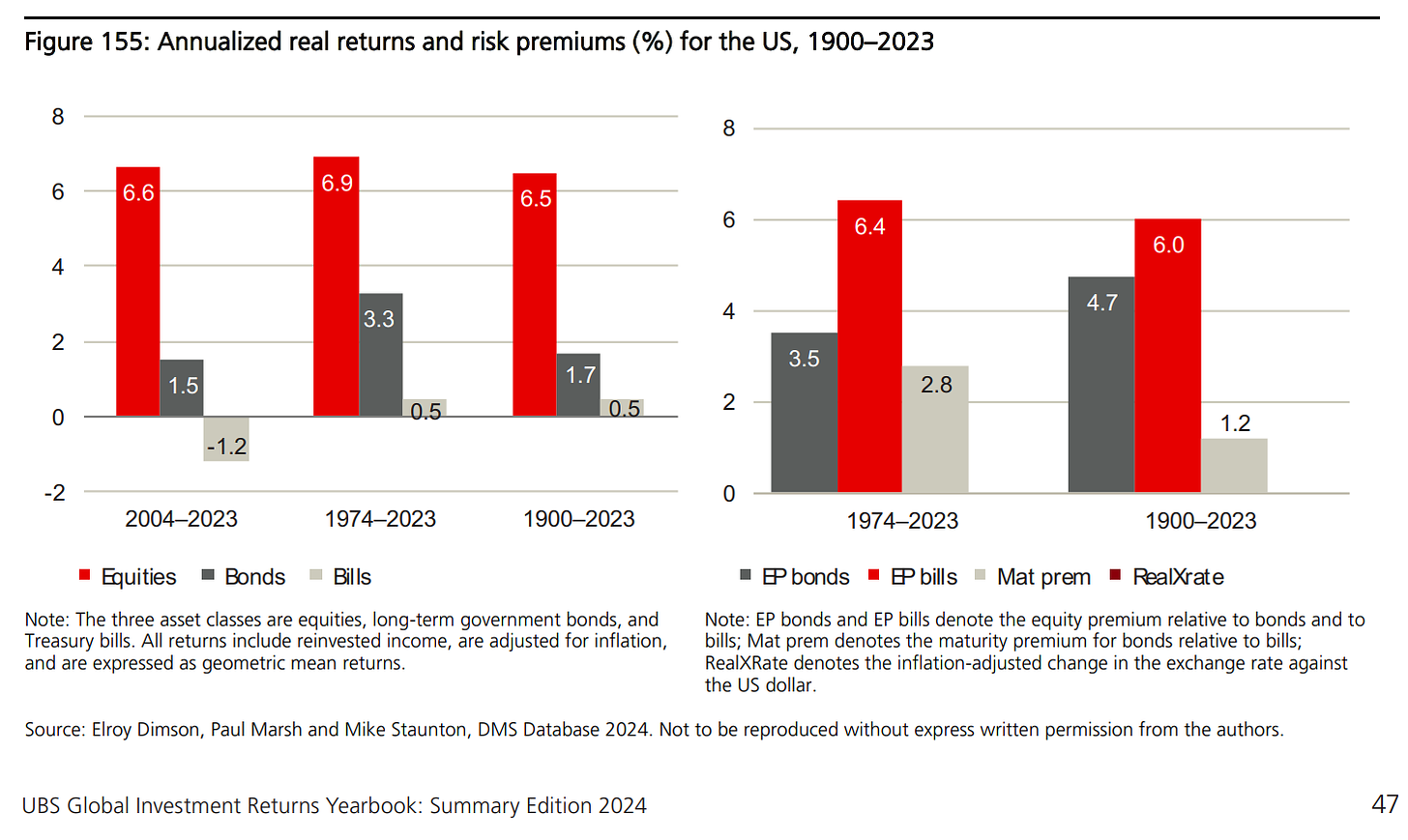
US equities: 6.5% real return, the highest common-currency return while in more recent history: 6.9% for the period 1974-2023 and 6.6% for the period 2004-2023
US bonds: 1.7% real return, while in more recent history: 3.3% for the period 1974-2023 and 1.5% for the period 2004-2023 (2022 biggest bear market with the big drag, but likely looking way better going forward as the recovery is underway)
👉 How much do US stocks return to investors + how are returns distributed?
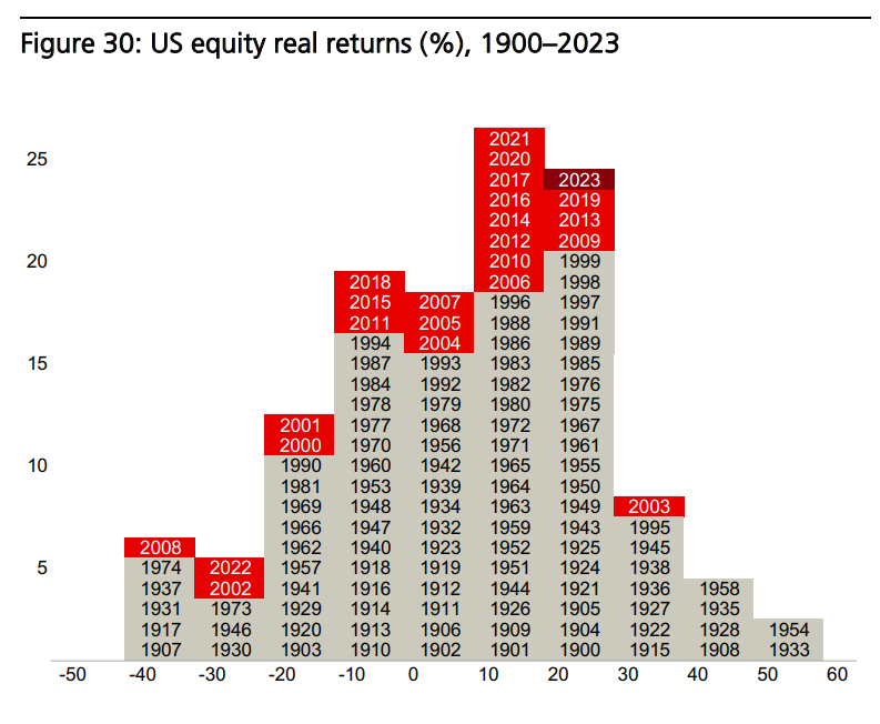
in an average year, the real return on US equities was 8.4% (the worst performance over a single year was in 1931 while the best in 1933) as the returns include reinvested dividends and are adjusted for US inflation
the histogram shows not only the distribution of historical returns, but also the years in which returns of various magnitudes occurred!
👉 What about US government bonds returns to investors + the distribution?
In an average year, the real return on US government bonds was 2.2%. The worst
performance was in 2022 while the best in 1982
👉 The Evolution of Global Equity Markets from 1899 to 2024
“The US equity market overtook the UK early in the 20th century and has since been the world’s dominant market, apart from a short interval at the end of the 1980s when Japan briefly became the world’s largest market. The US has regained its dominance and today comprises an astonishing 60.5% of total world capitalization.“
“This reflects the superior performance of the US economy, the large volume of IPOs, and the substantial returns from US stocks. No other market can rival this long-term accomplishment. But this makes it dangerous to generalize from US asset returns since they exhibit “success bias.” This is why the Yearbook focuses on global returns.“
“Russia was a large market in 1900, accounting for some 6% of world capitalization. Austria-Hungary was also large in 1900 (5% of world capitalization) and, while investors didn’t experience total losses, in real terms, it was the worst-performing equity market and the second worst-performing bond market of our 21 countries with continuous investment histories“
👉 New Economy vs Old Economy = Innovation & Disruption vs Classic players via Industry weightings in the US (left) and UK (right) since 1990 to 2024:
“In the 2015 Yearbook, we asked whether investors should focus on new industries – the emerging industries – and shun the old declining sectors. We showed that both new and old industries can reward as well as disappoint. It all depends on whether stock prices correctly embed expectations.
For example, we noted above that, in stock-market terms, railroads have been the ultimate declining industry in the US in the period since 1900. Yet, over the last 124 years, railroad stocks have beaten the US market, and outperformed both trucking stocks & airlines since these industries emerged in the 1920s and 1930s.
Indeed, the research in the 2015 Yearbook indicated that, if anything, investors may have placed too high an initial value on new technologies, overvaluing the new and undervaluing the old. We showed that an industry value-rotation strategy helped lean against this tendency and generated superior returns.”
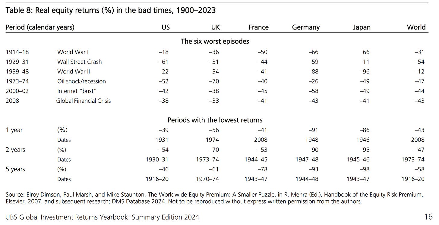
👉 What Do the Bad & the Good times (business cycle) tell global investors?
Bad times - notable episodes of world political and economic turmoil since 1900:
The 6 worst episodes for global equity investors were the two world wars and the four great bear markets: the Wall Street Crash and Great Depression, the first oil shock and world recession of 1973–74, the 2000-2002 bear market that followed the internet bubble, and the Global Financial Crisis (GFC) centered in 2008
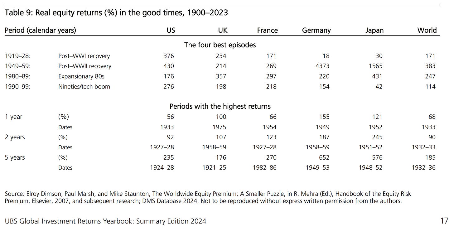
Good times - real returns over 4 “golden ages” for stock market investors:
The 1990s was a period of great performance for the US market (276% real return) via the tech boom, while globally was the most muted of the four, with the world index showing a real return of 114% (held back by Japan)
The world index rose way more during the 1980s (247% in real terms) and the two post world war recovery periods: 171% in the decade after World War I (1919-1928) and 383% over World War II (1949–1959)
US had its most exceptional returns after each of the 2 World Wars: 376% & 430%
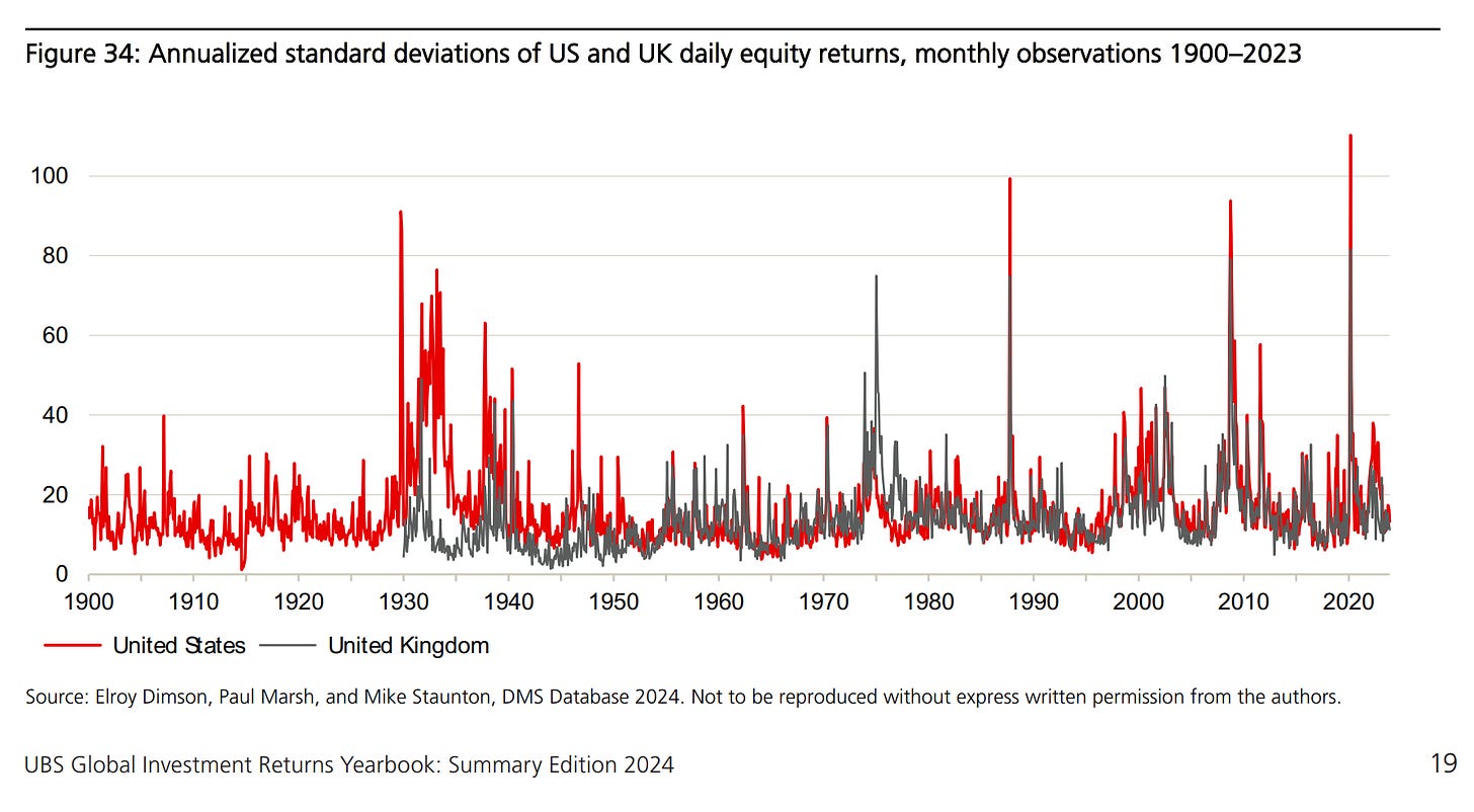
Complementary, looking at volatility after in the 2 tables we looked at yearly returns:
chart shows that volatility appears to be mean-reverting, with long periods of subdued stock fluctuations and occasional bursts of extreme volatility
the latter are associated with economic or market shocks that come as a surprise to the market: examples are the Wall Street Crash, the 1970s Oil Shock, Black Monday in October 1987, and the Global Financial Crisis
Shocks, by definition, are hard to anticipate, but the chart shows that subsequent volatility has historically dampened down quite rapidly
👉 The Fear of the Downside and how does Downside look like exactly?
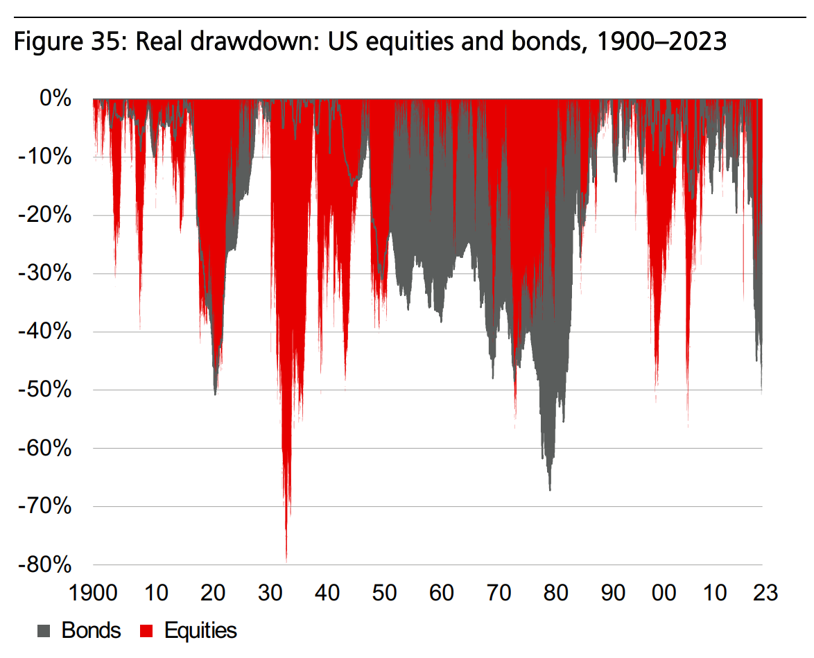
Investors are concerned about buying assets and then experiencing a dramatic fall in their value. To examine the prevalence of this historically, we can evaluate a portfolio’s drawdown in value, relative to its prior high-water mark.
So, US Stocks and Bonds Real Drawdowns (peak-to-trough decline during a period):
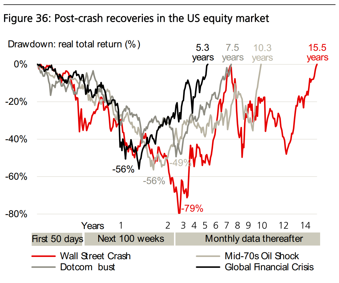
after the Wall Street Crash (Great Depression 1930s), US stocks fell to a trough in July 1932 that was 79% below their September 1929 peak in real terms
next large drawdown was from January 1973 until October 1974, when down by 48% in nominal terms & 56% in real terms
after the tech bubble burst in March 2000, US equity prices again collapsed and, by October 2002, had fallen 52% in real terms
Global Financial Crisis with the low point in Feb 2009, down 56% in real terms
the next big drawdown (hairline thin red line because of its brevity) began in February 2020 when US stocks fell 35% in real terms due to the COVID pandemic
👉 After the Bad and Ugly Downside Drawdowns, how do Recoveries look like?
Wall Street Crash (Great Depression 1930s): long recovery period 15.5 years
January 1973 - October 1974: only 26 months to recover the nominal high, but in real terms, equities were underwater for over 10 years
2000s Tech bubble: lower recovery period = 7.5 years
2007-2009 Global Financial Crisis = 4 years to recover
2020 Covid pandemic: rapid recovery was markable = 5 months
Did you spot the tendency? Recovery periods are shorter and shorter and shorter!
👉 Switching to Bonds now because … ‘My name is Bond, Yield Bond!’ and in case you missed my recent 2 part series on investing in Bonds/Cash/Credit, there you go:
✍️ My name is Bond, Yield Bond! The Return of Yield! Getting Paid to Chill ... (Part I)
✍️ My name is Bond, Yield Bond! The Return of Yield! T-Bill & Chill ... T-Bond & Long (Part II)
Research is NOT behind a paywall and NO pesky ads here unlike most other places!
Before moving on, do you enjoy this extensive research by finding it interesting, saving you time & getting valuable insights? What would be appreciated from you?
Just sharing it around (restack, email, forward, re-tweet) with like-minded people & hitting the ❤️ button. Your support will naturally also make possible more & more independent investment research: from a single individual … not a fund, bank, click-bait media company or so … !
👉 US debt market by type of security:
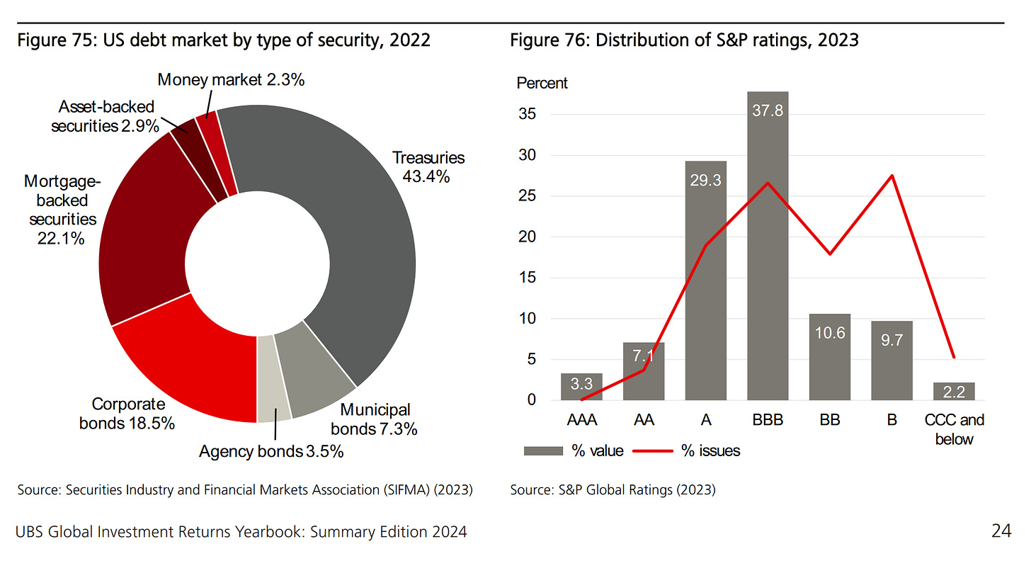
Figure 75: grey-shaded areas show general government securities (treasuries dominating 43.4%), while the red-shaded corporate debt securities (mortgage-backed securities (MBS), the biggest category with 22.1%, Corporate bonds 18.5%)
Figure 76: distribution of Standard & Poor’s (S&P) credit ratings with the final bar combining CCC, CC, C and D ratings:
fewer than 4% of bonds are high-grade, or just over 10% by value
around half of corporate bonds fall into the Investment Grade (IG) category, representing 78% of corporate bond value
high-yield (hereafter, HY) bonds (also referred to as “non-investment grade” or “junk” bonds) are those rated BB (Ba) or lower. While just over half of all bonds fall into this category, they represent just 22% of overall value. Clearly, these
issues are individually much smaller than IG bonds
👉 Default rates on US Corporate bonds:
default rates since 1866 have clearly fallen over time
the average default rate was 4.0% in the late 19th century, 1.3% from 1900-1945, and just 0.3% from the end of WW2 until 2008
“Default rates cluster in time, with a serial correlation of 0.63. The worst cluster occurred in the 1870s, when the massive boom in railroad construction of the 1860s was followed by a decade of defaults. From 1873–75, defaults totaled 36%. This was much worse than during the Great Depression when the worst three-year default total was 13%, placing it only fourth worst among all three-year periods on record.”
👉 Going global: default rates on global Corporate bonds by bond rating:
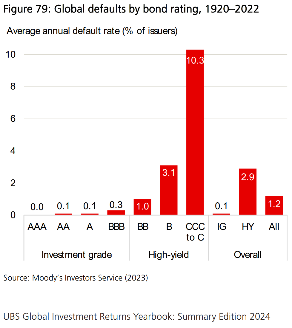
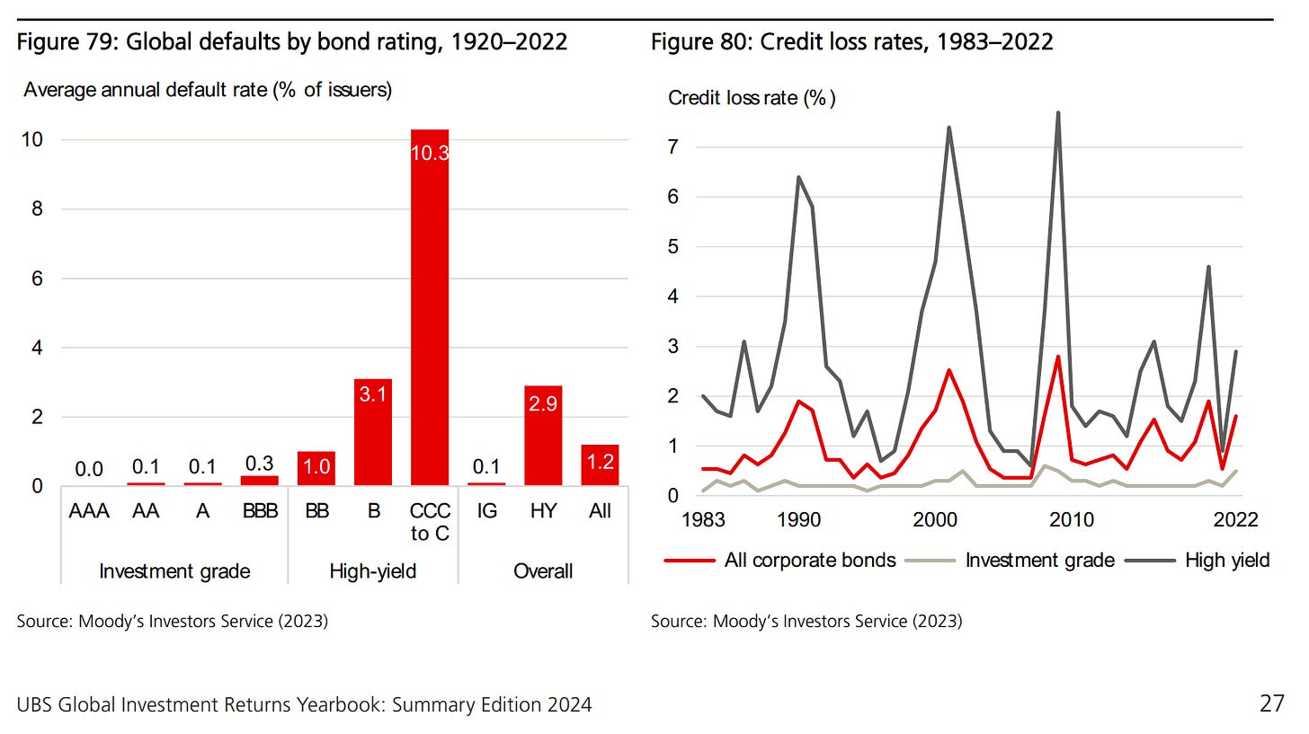
Figure 79 provides further insights with the average annual default rate (as a percentage of issuers) from different credit ratings, over the 103 years from 1920 to 2022. It shows that:
default rates are very low for IG bonds, ranging from zero (to one decimal place) for AAA bonds through to 0.3% for BBB bonds
the average annual default rate across all IG bonds was just 0.1%
default rates for HY bonds were far higher, ranging from 1.0% for BB bonds up to 10.3% for bonds rated CCC or below
the average annual default rate across all HY bonds was 2.9%
across all corporate bonds, the annual average default rate was 1.2%
👉 Key points & Bonds 101 - defaults rates, recovery rates and ultimately the most important credit loss rates:
default rates overstate the loss to bondholders, as in almost all cases, there is recovery of value; more senior bonds typically offer a higher recovery rate as they have a greater claim to assets compared with bonds ranked lower down the pecking order
GLSS research assume a 50% recovery rate as an average across corporate bonds and over time. They cite Hickman (1960) who found an average recovery rate of 63% over 1900–44 and Moody’s which reported an average of 41% for 1982–2008
Moody’s (2023) reports that the average value-weighted ultimate recovery rates from 1983–2022 were 56% and 39% for first and second lien bonds; 34% and 27% for senior unsecured and senior subordinated bonds; and 28% and 14% for subordinated and junior subordinated bonds
Hence, figure 80 via Moody’s on credit loss rates over the 40 years from 1983 to 2022:
losses were much higher during recessions and equity bear markets, most obviously for HY bonds
HY bonds with 2.7%, while for IG bonds, it was just 0.2% (peanuts)
the average annual loss rate for all corporate bonds was 1.0% (not much at all)
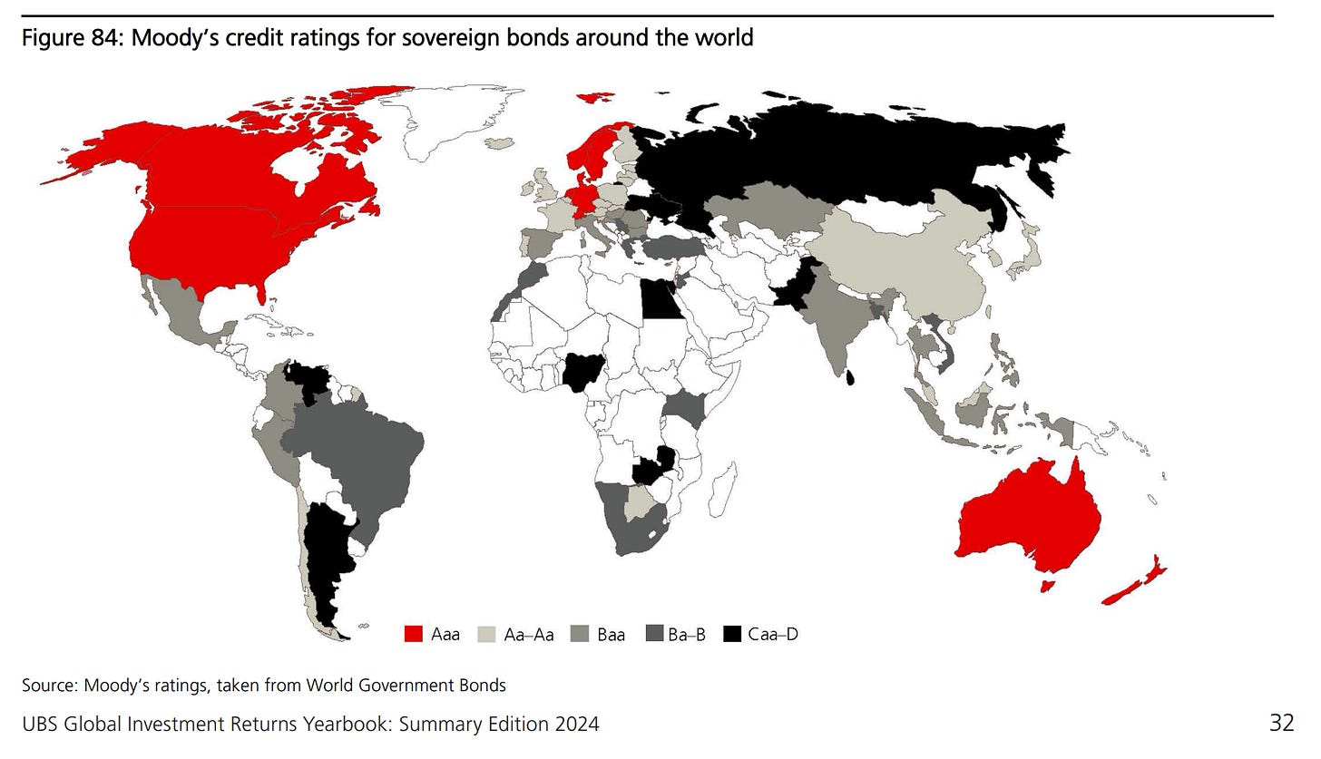
👉 Countries time: Moody’s credit ratings for sovereign bonds around the world
Government bonds are often perceived as being default risk free. Countries that control their own monetary policy can print money and/or tax their inhabitants, rather than default. So, in most developed markets, investors can be confident that they will receive the interest payments promised and that the bond will be repaid. However, the purchasing power of those bond disbursements may, of course, be eroded if the country chooses inflation over default
Historically, many countries have defaulted on their foreign currency debt. Meyer, Reinhart and Trebesch (2022) document that there have been 313 sovereign debt restructurings since 1815. Argentina holds the record with nine defaults. Since 1970, there have been more than 100 cases of government defaults on their foreign currency
Clearly, sovereign bonds are not default-free & have different degrees of credit risk which is reflected in the credit ratings assigned to countries. Figure 84 shows the current Moody’s ratings for countries around the world, and of the DMS 35 markets:
11 had Triple A ratings: Australia, Canada, Denmark, Germany, Netherlands, New Zealand, Norway, Singapore, Sweden, Switzerland and the US
At the other end, from the DMS 35 countries club, 5 were rated below IG: Argentina, Brazil, Greece, Russia and South Africa. Russia defaulted on its foreign currency debt in 2022 after the start of its war in Ukraine.
👉 Lastly on bonds, the Credit Premium: how large is the credit risk premium?
Much of the performance of fixed income portfolios can be attributable to 2 variables:
a maturity premium that is the incremental return expected from investing at the long end of the maturity spectrum compared with Treasury bills, and
a credit premium that relates to the additional return expected from taking on default risk relative to government bonds (generally assumed to be default free)
Both bond premiums – the maturity premium and the credit premium – like the equity risk premium, relate to the extra return that investors require for taking on additional risk. They are therefore forward-looking concepts, but their likely future magnitude is typically inferred from historical data. It is frequently assumed that, if the measurement interval is long enough, the historical premium will be an unbiased estimate of the future premium.
Measuring the Credit Premium (for US & UK Investment Grade IG corporate bonds)
GLSS provide a ballpark estimate of the credit premium by deducting historical default losses from credit spreads. Over 1866–2008, the average credit spread and default rate were 1.53% and 1.52% and they assumed a recovery rate of 50%
Hence, implying a historical Credit Premium across all IG corporate bonds ≈ 0.8%!
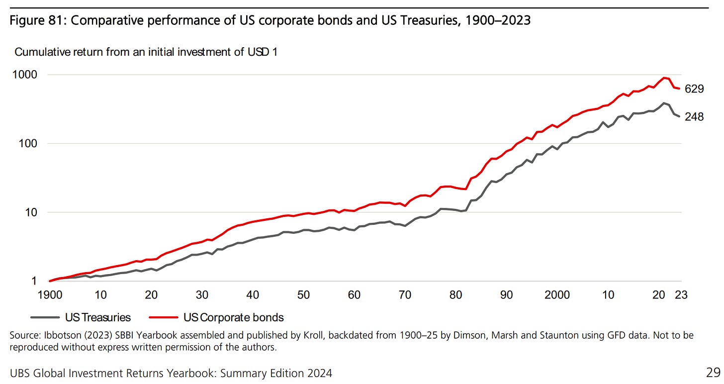
a more direct way to compute the historical credit premium is to compare the long-run returns achieved on corporate and government bonds. The SBBI credit premium has been widely used by practitioners and in academic research.
Figure 81 shows the IG corporate and government bond returns from 1900–2023:
1$ dollar invested at the start of 1900 in long-dated US Treasuries would have grown to USD 248 by end-2023, an annualized return of 4.55%
a corresponding investment in long-term US corporate bonds would have grown to USD 629, providing an annualized return of 5.34%
thus, after 124 years, the terminal wealth from investing in US corporate bonds was 2.5 greater than from US Treasuries
Hence, the annualized Credit risk Premium over the 124 years since 1900 was 0.76%!
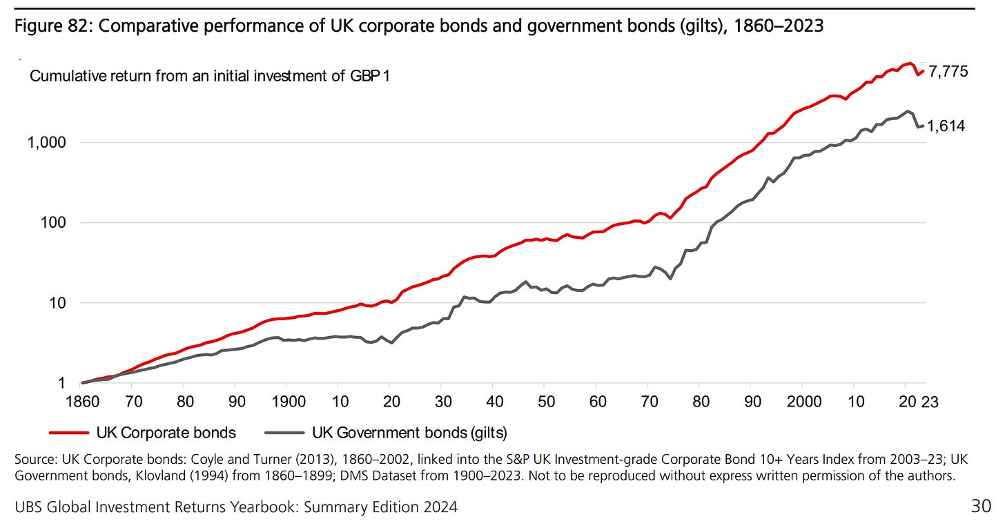
The UK case:
1 GPD invested at the end of 1860 in UK gilts would have grown to GBP 1,614 by end-2023, an annualized return of 4.64%
a corresponding investment in UK corporate bonds would have grown to GBP 7,775, an annualized return of 5.65%
thus, after 163 years, the terminal wealth from investing in UK corporate bonds was almost 5 times greater than from UK gilts
Hence, over the 163 years since 1860, the annualised credit risk premium was 0.97%!
All in all, based on long-run evidence from 1900 for the US and 1860 for the UK:
Investment Grade (IG) corporate bonds have offered a significant credit risk premium over equivalent government bonds close to 1%
High-yield / Non-Investment Grade / ‘Junk’ corporate bonds is some 2% higher than this
N.B. and reminder: across long time horizons, a 1-2% difference in returns makes a huge difference in the value of the investment portfolio
3 more key takeaways from the Global Investment Returns Yearbook 2024 before going to the Bonus charts section:
“Since 1900, equities have outperformed bonds, bills and inflation in all 21 markets for which the Yearbook has a continuous history
Equities have dominated bonds, while bonds have outperformed treasury bills. The same held true for the rest of the 35 markets with start dates after 1900
The majority of long-run asset returns are earned during easing cycles. From 1914 to 2023, US markets were in a rising interest rate mode 45% of the time and in a falling mode 55% of the time. The annualized return on US stocks and bonds was 9.4% and 3.6% during easing cycles, compared with just 3.6% and -0.3% during hiking cycles. UK data since 1930 reveals a similar pattern”
And one big single takeaway from my side: Global Diversification for the Win!
👍 Bonus: 7 long-term Maverick Charts … that say 10,000 words!
2 food for thought charts for you while I’m working on a special Macro take dedicated specifically to Inflation, a key and hot topic that was also requested by plenty!
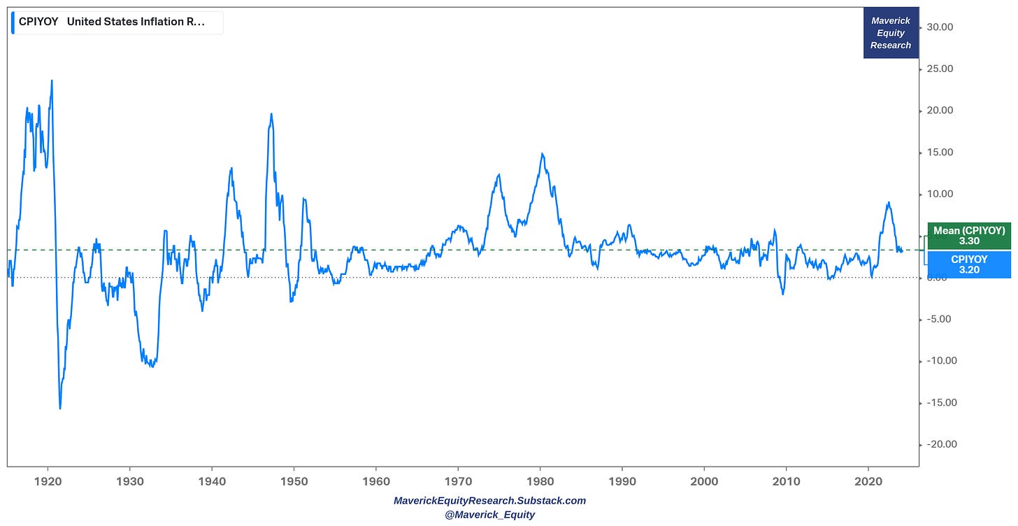
110 years of Inflation in one Maverick chart (my Tweet can be read here):
👉 average across 110 years = 3.3% (green)
👉 current value just there = 3.2% (blue)
Can we say we reached the target already in terms of how inflation behaves and is present across time via the business cycles the economy experiences overall?
35 years of Inflation rate (blue) and M2 money supply growth (red):
👉 M2 growth was -4.63% last year which is let this one sink in: the fastest pace of money supply compression since Jan 1933!
👉 as it mattered creating inflation by going parabolic up in 2020-2021 with even a +27% growth, it is working now through the system in order to cool-off inflation via currently growing negatively at a -1.42% rate
What matters for inflation, what are the key fundamental drivers? How about developing a framework that is understandable for most people without loads of jargon? What is the current outlook, and most of all, what special forward/leading metrics & measures are our there to look & capture inflation looking into the future!
Stay tuned! Special Inflation report coming to town soon … !
Real GDP quarterly growth rate for the last 20 years:
👉 Q4 2023: +3.2% solid growth which is materially above the 2.08% 20-year average
👉 note also the 2007-2009 recession, and also the 2020 Covid down & up swing which are just 2 episodes from the business cycle … things recover, having a plan for when it happens makes it easy to weather the storm
Zooming out with the same GDP real quarterly growth via a 75-year time frame:
👉 Q4 2023: +3.2% solid growth which is just there with the 3.17% 75-year average
👉 this long time frame also shows how big of an outlier the 2020 pandemic was
N.B. working on the 3rd edition of my Macro take on the US economy where I will cover the current situation & as well as the outlook going forward. 2nd edition here:
✍️ The State of the US Economy in 45 Charts, Edition #2
The mighty S&P 500 via: 35 years of US interest rates with red bars as recession periods, S&P 500 quarterly returns, S&P 500 drawdowns … all in 1 single chart!
Key take-away:
👉 we have the fastest interest rates FED hiking cycle in the last 4 decades
👉 FED funds rate ABOVE the 2007 period, yet the economy is strong
👉 S&P 500 drawdown was in 2022, yet 2023 & 2024 no problem, +8.29% last Q
As Q4 2023 earnings season is done, when I find some more time, I’ll also release my 2 S&P 500 reports covering Performance & Valuation. Previous editions can be read:
✍️ The S&P 500 Report: Performance, Profitability & Special Metrics - Edition 4
✍️ Maverick Valuations: the Mighty S&P 500 - Edition 2
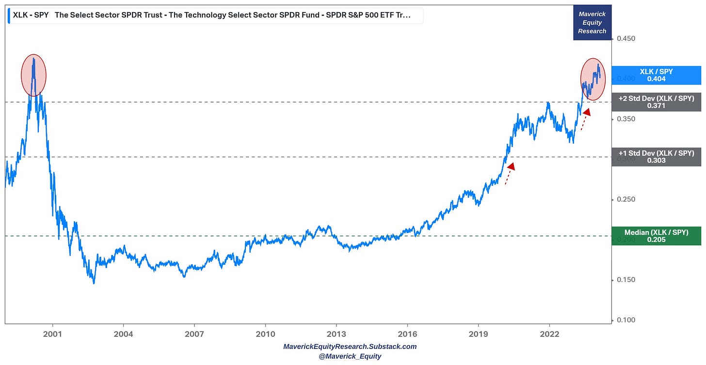
'US Tech is Taking Over the World Baby!'
👉 XLK tech ETF easily sitting 2 standard deviations above the mighty S&P 500 SPY
👉 way above the 25-year median, then during Covid it broke the +1 standard deviation … while in 2023 with the AI run even the +2 SD
👉 while tech today is real, works and brings a lot of value to the economy (2001 dot-com many empty concepts like pets.com) ... it's hard to ignore the recent parabolic run
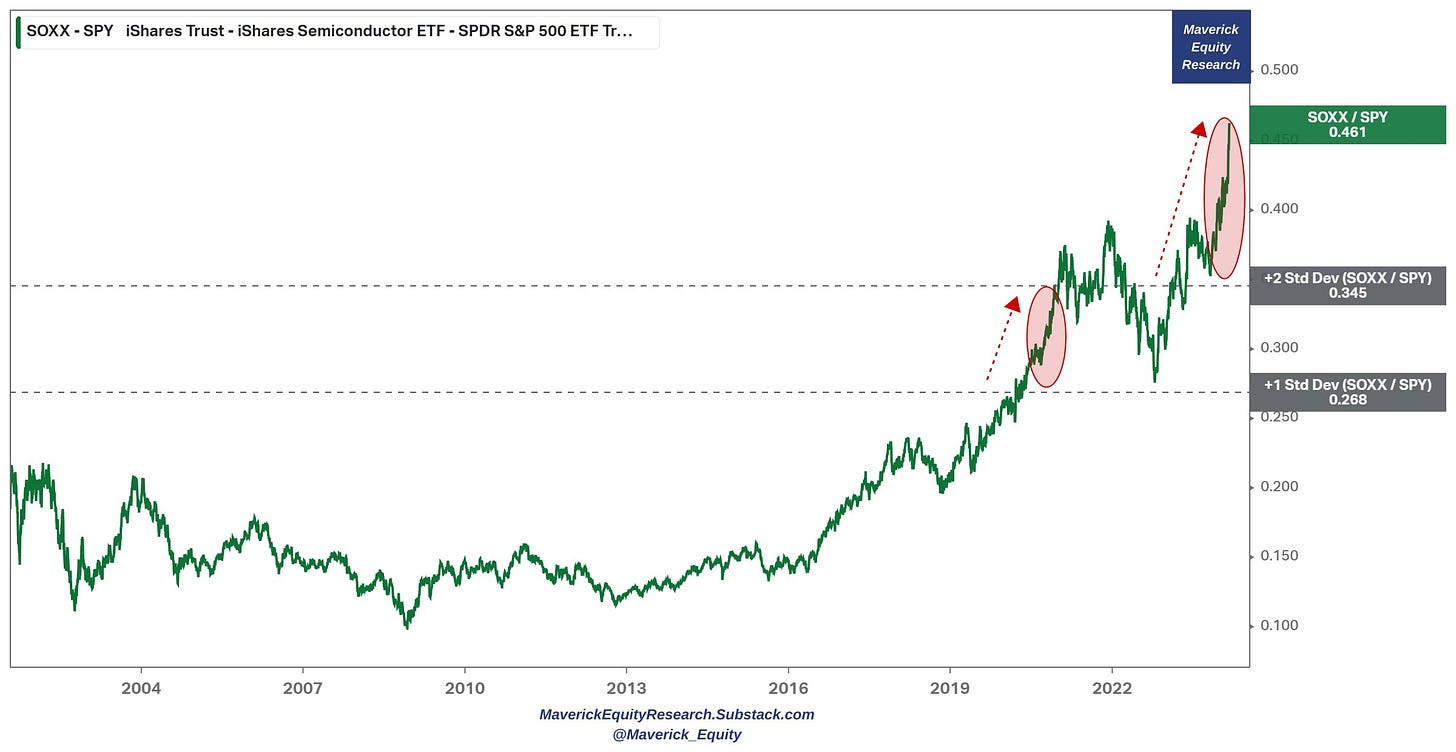
'US Semiconductors are Taking Over the World Baby!'
Semiconductors via SOXX ETF relative to the mighty S&P 500 SPY👇
👉 2020 broke above the +1 standard deviation (SD)
👉 2023 broke above further ... the +2 SD
Let that sink in ... and bring the sink!
I hope you enjoyed this zooming out session via 100+ years charts, that you got a lot of food for thought, and that you will leverage the deep history to navigate the future!
Research is NOT behind a paywall and NO pesky ads here unlike most other places!
This post took more than 15 hours of work so that you save a lot of time and get great insights via a 15 minutes read. What would be highly appreciated from your side? Just sharing it around (restack, email, forward, re-tweet) with like-minded people and hitting the ❤️ button. This’ll give credit to the distinguished professors who made all this possible, and to myself for adding complementary insights via more sleek charts!
Your support will also make possible more & more independent investment research: from a single individual … not a fund, bank, or click-baity media company or so … !
Thank you! Have a great week!
Mav 👋 🤝





Thanks for sharing many long-term charts of the financial markets, which remind us to think about previous economic episodes and how the current one relates to (or not)! You might enjoy Mark Higgins (also write on Substack) recently launched book: Investing I. US Financial History fascinating: https://enlightenedinvestor.com/
Mind expanding data